


Your website’s design has a greater impact on your overall business perception than you think. It is often the first unspoken representation of your business, either building or breaking the trust of users. Users are fast. They can form conclusions about your business within seconds based on imagery, typography, layout, and other subtle design aspects.
Here are five design aspects that I typically notice right away and address first in any website redesign, which will keep visitors coming back to your website.
Visual Hierarchy
One of the biggest issues businesses face is the lack of visual hierarchy on their website. A website’s structure should be as clear as possible to get information to the user.
On the homepage specifically, the order of sections should usually be prioritized from most important to least important. That means having pertinent information such as a phone number, main products and services, contact buttons, and more near the top of the page. This doesn’t mean cramming everything your business does at the very top of the page, but it means structuring the layout intentionally to show a hierarchy of information.
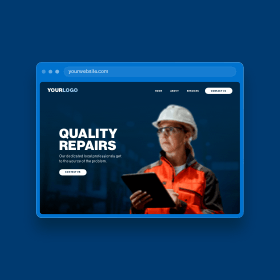
The homepage should be a roadmap for the user to view important information, leading them to internal pages and eventually to purchase, contact, or accomplish the goal of your website. Take this website as an example:
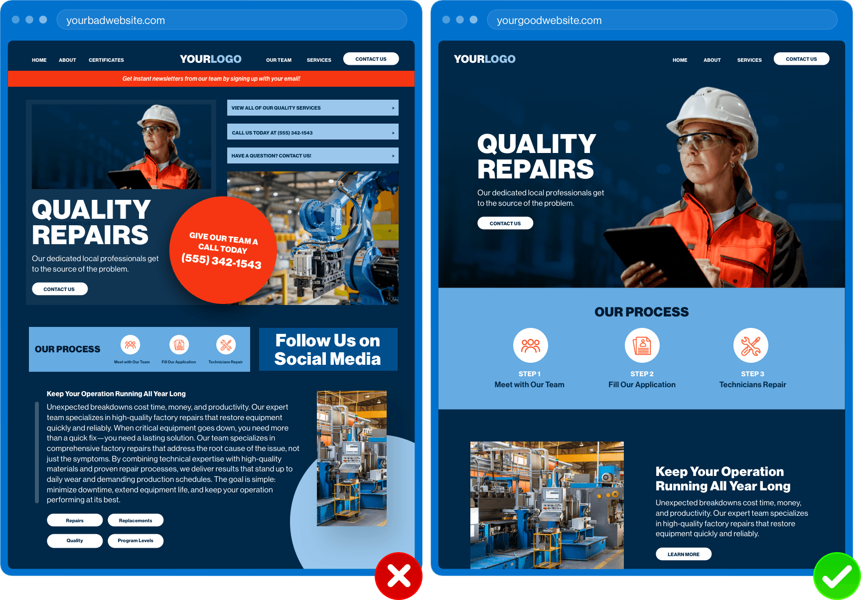
The website on the left lacks structure. Every callout demands the user’s attention, whereas the website on the right showcases the same business with a redesigned website. This design orders information in a way that highlights the most important information first, such as the main service, critical call-to-actions, and more. The user should be able to follow a natural flow down the page, clearly going from one piece of information to the next. It should be evident what the user needs to do next based on viewing the visual structure of the page.
Learn how heat maps can give you better insight into your website structure.
Authentic Imagery
Update your images! Displaying authentic imagery and video taken at your place of business, including employee headshots, product photos, service areas, and b-roll footage, is more personal to the user compared to stock photography.
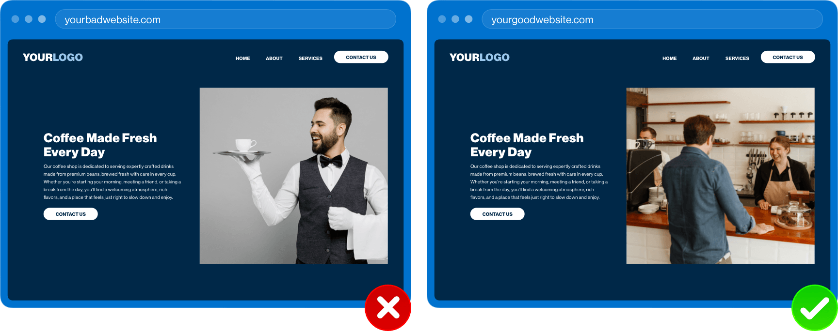
When the user senses a glimpse of your business through the images on your website, they develop a better understanding of who you are and what you stand for. Actual photos and videos of the people and products of your company shows that you are more trustworthy than the competitors using stock.
Plus, no one likes a standard group high-five stock photo. Check out these suggestions for choosing stock photos if you don't have an option to use your own people or products.
Brand Consistency
Brand consistency allows the user to immediately recognize that the website they are currently visiting is your website. Designers create this feeling by incorporating brand colors, brand typography, and other brand styles throughout the website, ensuring that no matter what page the user may be on, they will know it is your website.
Some may think that this translates to placing your logo anywhere and everywhere; however, this is an unnecessary solution. Your brand shines through by being consistent and cohesive with design styles.
- Are your buttons the same size, shape, color, and style?
- Are your headlines consistent in fonts and sizes?
- Do images have the same overall look and feel?
- Does your brand tone come across in the voice and messaging?
Read how to make buttons irresistible or how to choose fonts for more helpful information.
Clear Messaging
Related to the previous takeaway, the value of communicating clearly in website content cannot be understated. Confusing headlines or headlines containing too much “fluff” will only lead to confusion for the user.
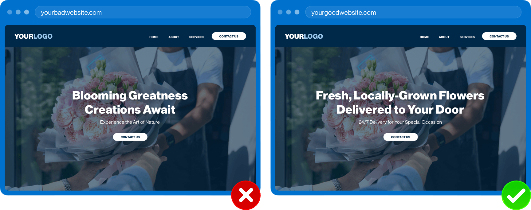
As stated above, users can be fast, especially if they are looking for something specific. If unclear content is bogging them down, they will hesitate buying into a product or service, and they won’t hesitate to leave the site. Make the path from converting a visitor to a customer easy with straightforward content.
Accessibility
Finally, one glaring issue we come across often is insufficient color compliance. Businesses will often use a brand color well-intentionally, especially for call-to-action buttons; however, without enough contrast, making the content difficult to read.
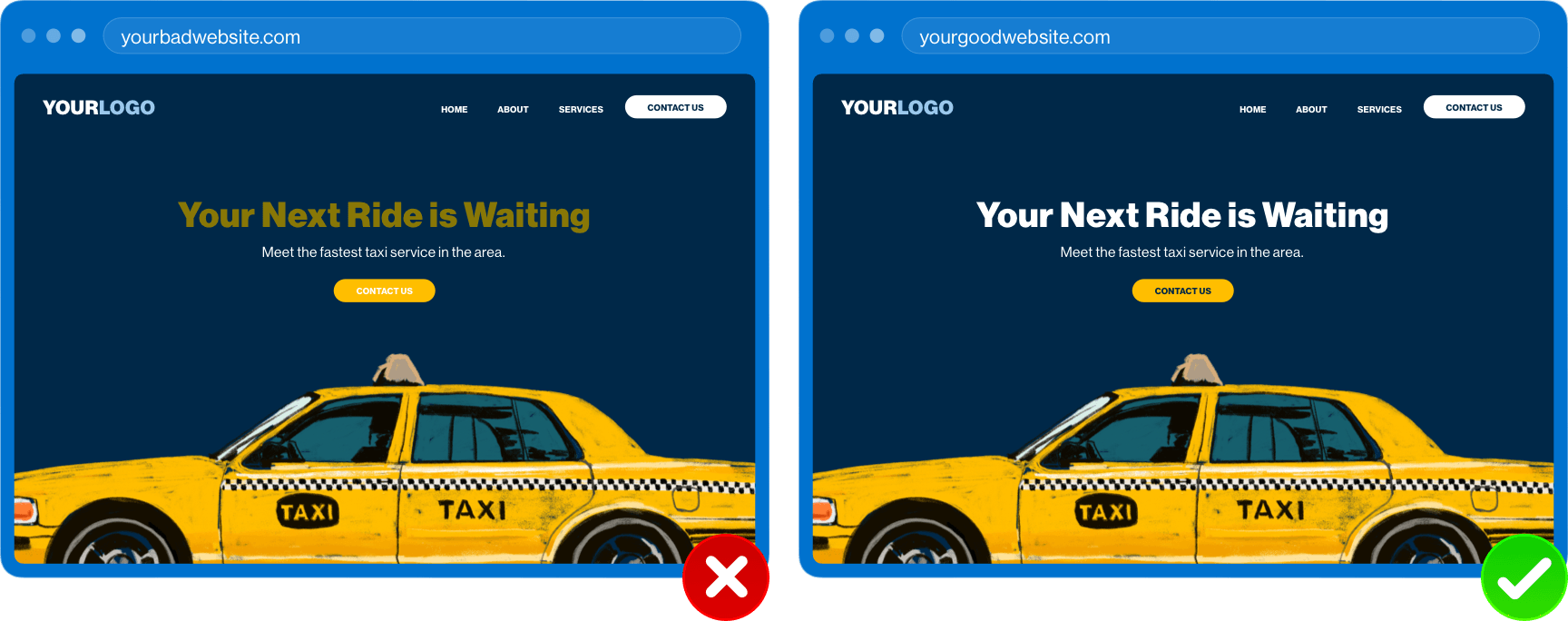
Beyond color compliance, there are a number of opportunities to make your website more accessible for everyone to use, including people with disabilities:
- Add Alt Tags for all images
- Label form fields
- Use clear call-to-action text
- Provide controls, including closed caption, on videos
- Allow keyboard navigation capabilities
Itching to learn more about accessibility? Check out how we are creating better website experiences through accessiBE and Secure Privacy.
What Next?
What can you do right now to get started? Sit down for 15 minutes (set a timer if you need to) and review your website with a user’s perspective in mind. You don’t have to catch everything initially. Do simple things like reading your content, checking how outdated photos are, looking at the contrast between colors, and scrolling through the homepage for structure. If anything seems out of place, out of date, or out of control, it may be time for a website redesign.
Want a full analysis of your website and marketing approach? Our team would be happy to help you! Reach out to start a conversation today.

