


Do your buttons look like buttons? If users are even the slightest bit unsure of the action a button causes, they will more than likely not interact with it. A red flag should be going off in your mind concerning your marketing strategy since the goal of most marketing items, whether websites, ads, or any other digital marketing techniques, is to get the user to act. You want results!
Similar to physical buttons on your microwave or television remote, user interface buttons are the means of carrying out an end goal. It is a direct cause-and-effect relationship. Buttons allow the user to act, determining the usability and interactivity of a website, ad, etc., making them a fundamental building block of user-interface design. There are numerous types of buttons, such as selection controls, iconography buttons, toggles, and more. For the sake of specificity, let's use standard text website buttons as our example throughout this article. But what consists of a button, and how can you make sure your buttons serve their purpose while providing the best possible results?
Make Buttons Look Like Buttons
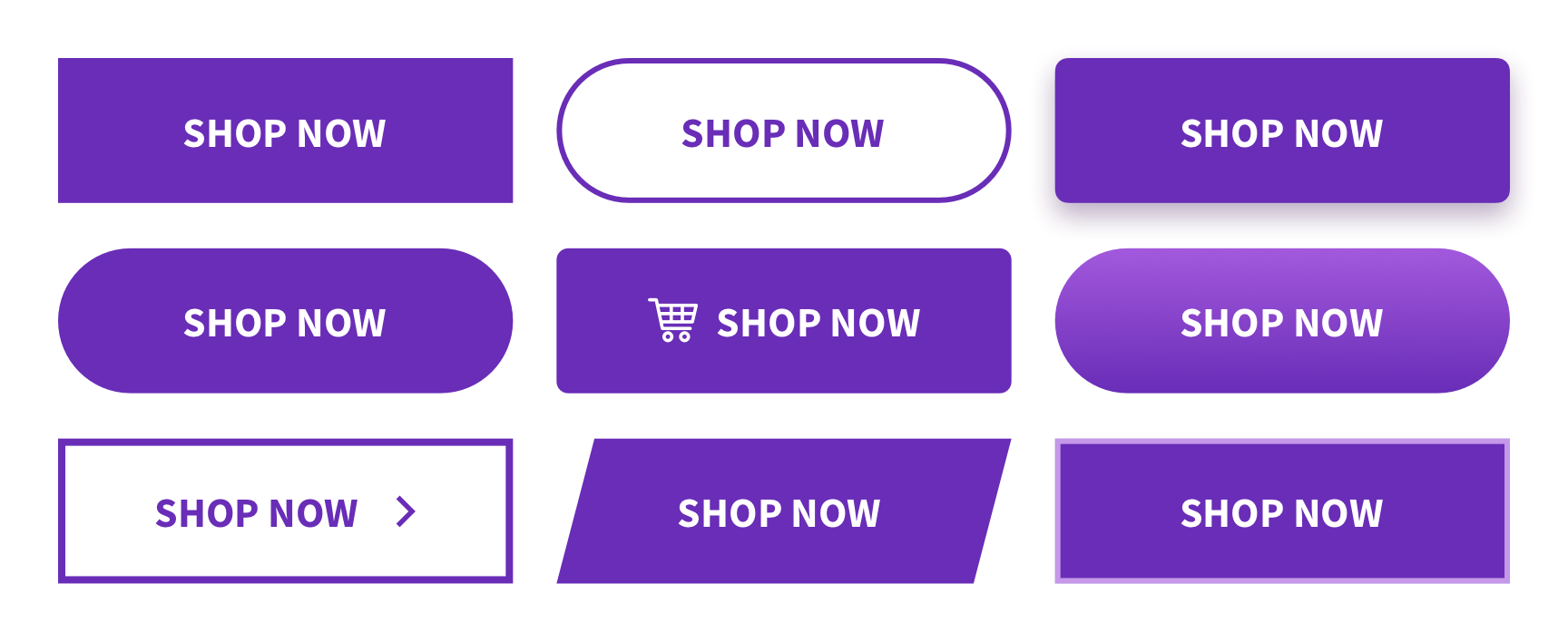
Buttons come in all shapes and sizes. The designer may choose the look of a button based on your company's branding guidelines or base it around industry standards. For instance, rectangular buttons with straight edges may emit feelings of seriousness, working well in the business and technology industries, while rounded buttons may feel friendlier and fit better in a website relating to the entertainment industry. It is best practice to design buttons that represent your brand.
Many aspects go into a simple button. The components of a button, such as space, amount, placement, size, and color, each play a part that can have a drastic influence on the entire outlook of your website.
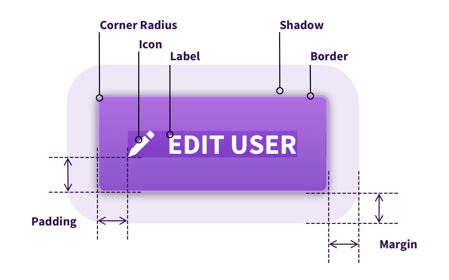
Space
The empty space around a button can often be as important as the button itself. In the design realm, this space is called padding and margins. Padding refers to the space between content and the outside border of that content, while margin refers to space outside of the element border. The amount of padding and margins impacts the width, height, and look of the button.
Having too small of margins, in other words, placing buttons too close together or around other elements of a website may cause an undesirable action, such as clicking the wrong call-to-action resulting in misdirection and overall loss of time.
TIP! Don't forget about the importance of white space! Check out our other article specifically about white space in website design.
Amount
As stated above, buttons are an effective way for users to perform actions or navigate through your website, but it is crucial to find a balance in the number of buttons. More buttons mean more options mean more issues. Having too many options creates a dilemma for the user leading to confusion and frustration. A way to solve this is to prioritize your goals with primary and secondary button styles. Choosing one or two types of buttons makes the website simpler and easy to use with less clutter.
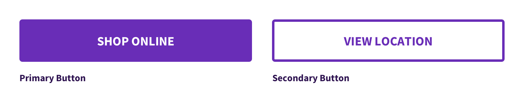
Creating a bold primary button style that will serve as enacting the primary goals of the website and a secondary button style that while still eye-catching handles the rest of the actions will allow the user to understand how to interact with your website, getting your message across.
Placement
Order tasks by the placement of buttons within the design. Using buttons or other call-to-action goals as a starting point in the wireframing process can help guide the design and movement of a website. When deciding on a general layout, place the button in an assumed position for discoverability. Users expect to find buttons immediately on a page, so placing them near associated elements will make their lives easier.
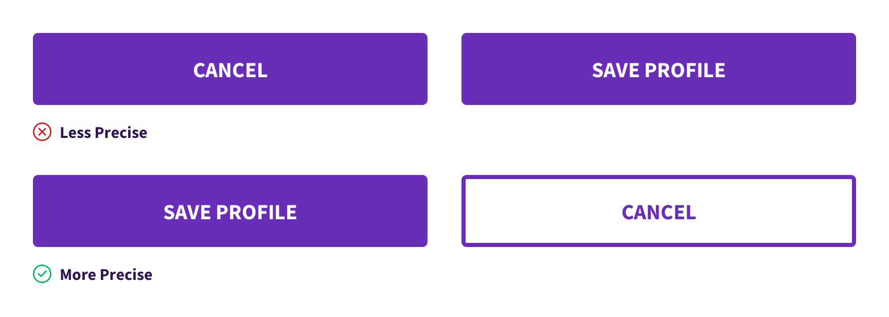
For example, in more defined micro-interactions, such as saving a profile page on social media, making the "Save Profile" option a primary button placed first and the "Cancel" option a secondary button will speed up the process of choosing for the user.
Sizing
Clicking a button should be an easy task for the user. Designing a button too small will make it difficult to select while making it too large will make it feel out of place.
Over time, button size recommendations have changed and the sizing of buttons depends on the medium. Buttons generally average around 40px to 75px in width for most desktop applications. Mobile buttons adhere to different rules than desktop buttons. An MIT Touch Lab study from 2003 found that the average human finger width is 8-10 mm. The designer should then create buttons at least 11mm or larger on mobile devices to accurately tap. This translates to between 40-75 pixels on average.
TIP! Try not to go below 16px on the button text size for readability.
Color
Possibly the most eye-catching construct of a button is color. We won't get into the whole psychology of color right now but choosing a color that represents your brand is necessary for the unity of a webpage. Keeping consistent with the colors makes for better flow and allows the user to recognize who they are interacting with.
Whichever colors are chosen, ensure there is enough contrast between the color of the button and the button label as well as the background.
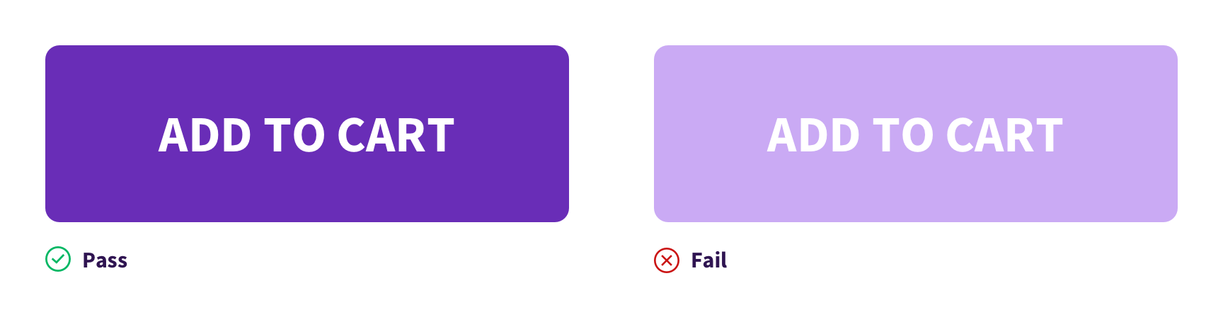
The left button in the image shows good contrast between the button color and the "Add to Cart" label, while the right button does not show enough contrast between the label and button color.
Not only is creating enough color contrast important for accessibility but also strong contrast brings more awareness and attention to the call-to-action. Remember this helps your marketing goal!
TIP! Once you have decided on a style of button, stick with it and be consistent! Creating too many shapes, colors, and styles of buttons will cause the user unnecessary difficulty. Instead, consistency will improve the accuracy of the user's desires and save time.
Make Buttons Sound Like Buttons
The button label, or text, has direct marketing significance. Don't assume that the user knows what happens when they click a button. As mentioned earlier, you want to make the button as predictable and precise as possible. Avoid nondescriptive words such as "yes", "no", and "ok". These will cause the user to second-guess the meaning of the button before clicking it.
Try using more descriptive language when creating labels. For example:
- Instead of "More," try "Explore All."
- Instead of "Ok," try "Submit Changes."
- Instead of "Done," try "Create Account."
Being more descriptive brings clarity to the user, which in turn strengthens the usability of the design. The wording chosen will make a world of difference in your website's functionality.
TIP! Be concise when providing button labels. You should try to shoot for one to three words maximum, if possible.

Make Buttons Act Like Buttons
Don't forget about button states! It is something that is often overlooked. Users expect feedback after they have initiated a button and if a button is even clickable in the first place. Button states communicate the status of the button to the user.

Creating different snapshots of how a button functions on active, hover, clicked, and disabled are essential for the communication between the user and the system. Without states, the website would feel flat and noninteractive, which could cause the user to leave the site.
Key Takeaways
Buttons can either make or break your marketing goals. Overall, many aspects dictate how buttons are formed, including space, amount, placement, size, color, call-to-action, and button states. A misstep in any of these aspects can play into the user's decision of clicking your button or not.
TIP! If you're unable to pinpoint the best feel for your button, try A/B testing. It is an effective way to find out which buttons will produce better results.
Don't want to worry about these fine details while still wanting to make your buttons irresistible to click? We can help! Email our account managers to talk about your next project.

