


If you have ever designed a website, you've probably heard the client ask "can we remove all that blank space?", which is understandable considering their mindset is to fill as much real estate on their website with content as possible. In the eyes of many, this blank space is regarded as wasted space.
However, white space is not wasted space; but rather an effective tool that designers use for conveying the importance of your business. In this article, we'll discover how important nothing really is.

What is White Space?
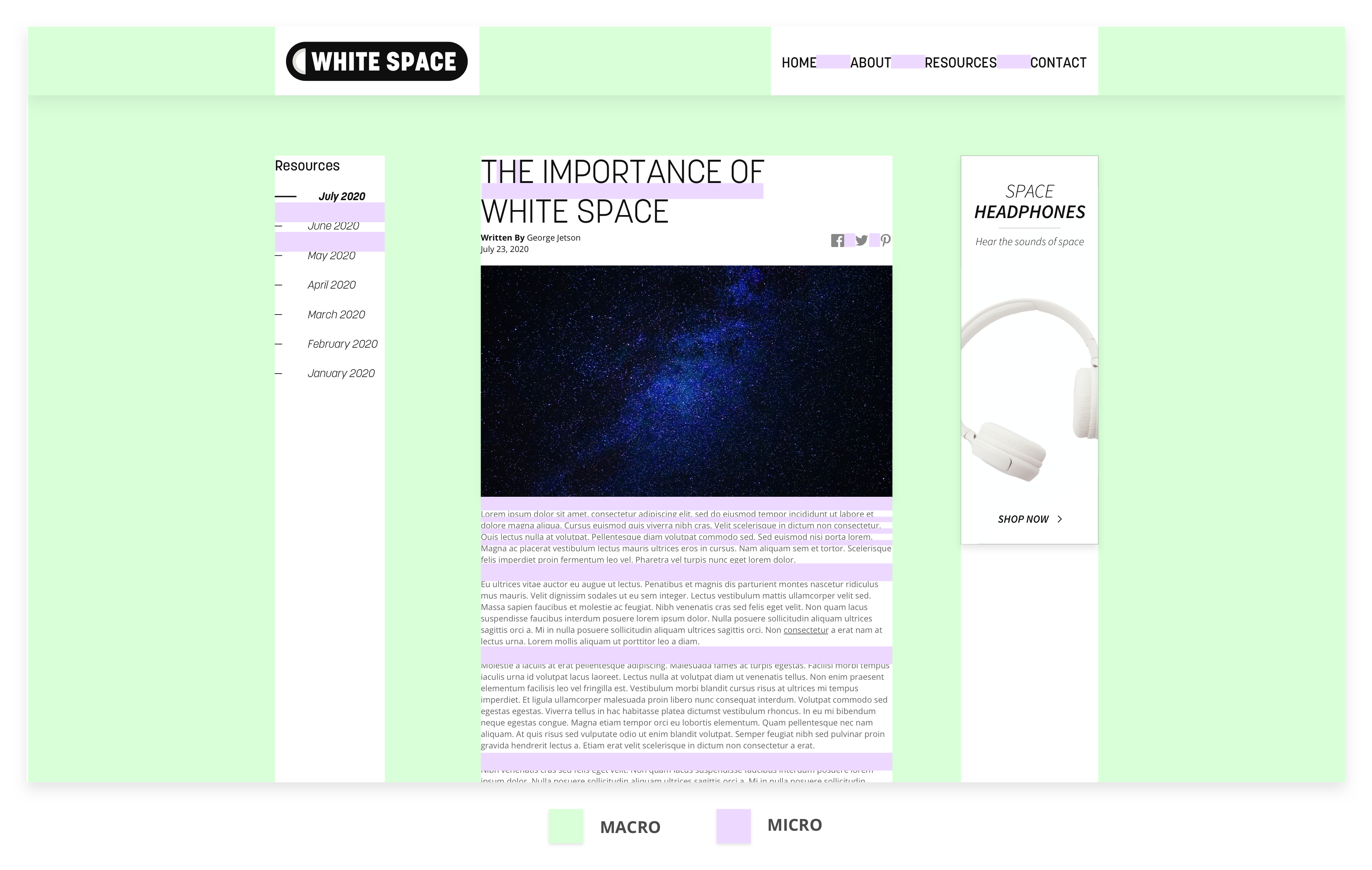
White space, also referred to as negative space in website design, is the blank or empty space that surrounds elements on a webpage. It is evident across all types of websites, from e-commerce to brochure sites. There are two distinct categories of white space: macro and micro.
Macro white space is the space between more substantial elements such as:
- Images
- Text Columns
- Content Blocks
Micro white space is the space between smaller elements like:
- Letters
- Lines of Text
- Menu Items
- Icons
Both macro and micro white space contribute to the overall look, feel, and functionality of a website. Below are examples of macro and micro white space on a website:
Clarity Through Simplicity
We see evidence of white space in many aspects of life. In your home, you wouldn't want to fill your wall with endless cluttered picture frames, unless you wanted a poster-filled room like a teenage fangirl. Instead, having a balance between one or a few pictures and the wall is more visually appealing.
The same concept applies to websites. The space between images, text, and content is equally as important as the content itself.
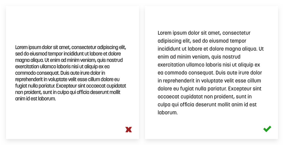
For instance, the space between letters, called kerning, or lines of text, called leading, is essential for readability. The user might feel a sense of tension and higher difficulty of reading in the image on the left compared to the same text in the image on the right.
Finding the Balance
The amount of white space also determines the relationship between elements. Less white space between elements allows the elements to appear as a group and vice versa. Space allows the user, whether consciously or not, to define how content is organized and dictates how it is perceived. The designer needs to find a balance between components and space.
This structure establishes order and hierarchy between elements that act as a roadmap to follow throughout the page, ultimately bringing attention to what is important or a call to action for the user.
Don't Forget About Aesthetics
Not only is white space an effective tool for clarity and emphasis, but also, it is visually enjoyable as well. Apple efficiently uses white space with a combination of bold statements and clear product imagery.

Apple
White space gives plenty of breathing room for the website's content, rather than the pattern of cluttered content we've seen in decades previous. The user will be more comfortable and find your website easier to utilize.
Lastly, despite its name, white space does not have to be white! Any color, pattern, image, or graphic can be used in place of white space. Chobani uses a soft beige combined with compelling imagery on their website.

Chobani
White space is a powerful weapon for organizing and adding focus to the content of a webpage; but also creates a visually appealing design. If you need help with the blank space on your website or lack thereof, we'd love to help you out!

