


Font Groups
If you have ever had to do any kind of school project, work presentation, social media post design, or any thing of the sort, you have probably run into that giant list of font options.
For some people, they might not care what font they pick and subsequently don’t realize the impact their choice may have had. Poor font choices can lead to the perception of unprofessionalism, laziness or lack of style. They can also distract from the purpose of the content if they are not legible or obnoxious.
A lot of times, these font mishaps could be avoided by just understanding these four major font groups and when to use them:
- Serif
- Sans-Serif
- Script
- Decorative
Serif & Sans-Serif
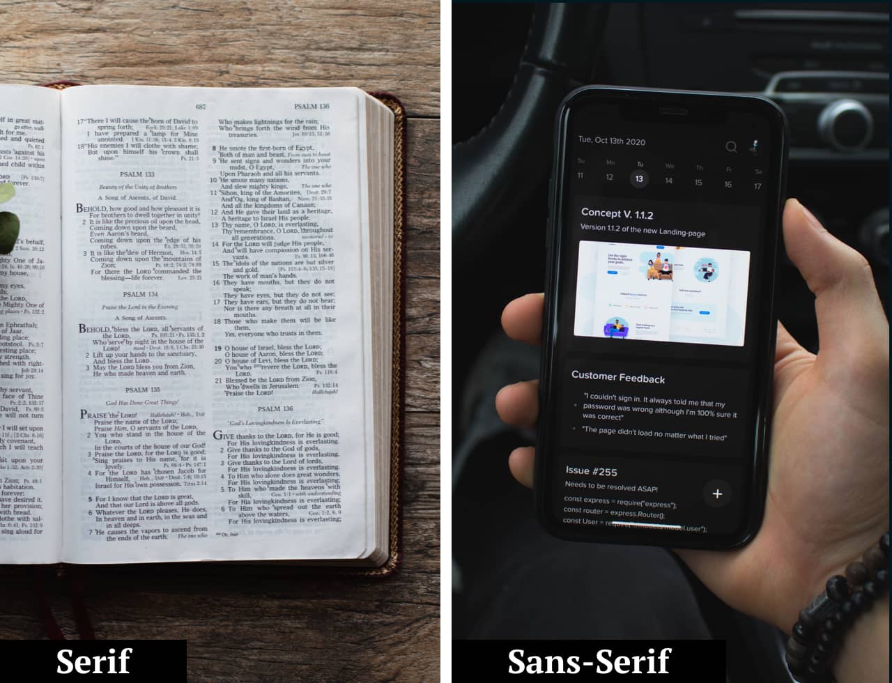
Serif and sans-serif are font groups that can be used for both bulk copy and for headings. These are the basic fonts you see in almost all areas of your life. But, what is the difference between the two of them?

The difference is detail. Serif fonts have little extensions on the ends of most characters that help them stand out from the rest. There are theories that these little details date back to stone carvings as a way to cleanup their lines.
But, when do you use these fonts? Serif and sans-serifs fonts work well almost anywhere, but especially in large blocks of text. In print, you typically see serif fonts because of how legible it is. In web, often you see sans-serif fonts because they are so concise and show up well on old devices.
Now, there is a lot of crossover, but generally if the text is very important or in long form, it needs to be serif or sans-serif.
Script & Decorative
Script and decorative font groups have probably the largest variety of collections. This is where people can get in trouble by going a little overboard on something simple.
A script font is typically in a hand-writing, cursive format. These are typically used for classic-style logos, quotes, etc. While a decorative font is usually themed with very artistic shapes and can really be anything. Decorative fonts are quite literally for decoration in a design.
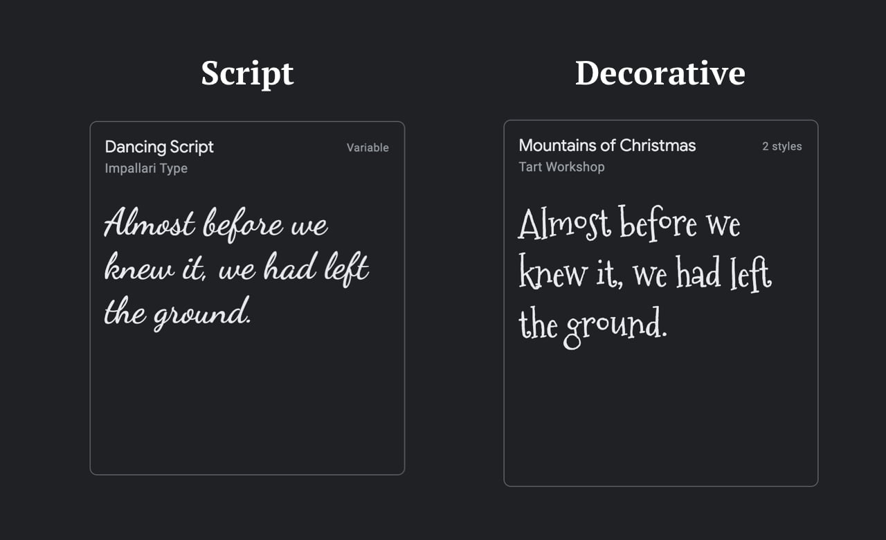
These fonts work great when trying to bring life to a design. They are typically seen in things like magazines, movie titles, album covers, etc.
These fonts usually have low legibility, which means they should not be used for text that is important or for long paragraphs.
For example, in the image below we have a page from our website using two sans-serif fonts, on the left. On the right is the same page using a decorative font. While the title is legible, you can see that the body copy is much harder to read.
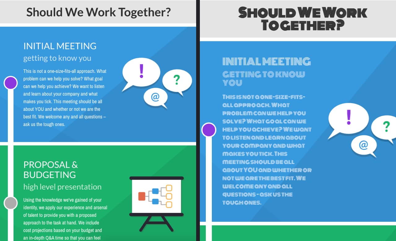
Remember, just because you can read the text, doesn’t mean someone with vision impairment or another disability can.
Wrap up
Now that you have learned what these four major groups of fonts are and when to use them, give a little more consideration to your next project. If you are creating a flyer for an upcoming event, have some fun with some type by using decorative or script fonts, while remembering to use serif and sans-serif for the important stuff!

