


“Can you make the logo bigger?” It’s a simple request that website designers get asked more often than you think. So much so, that it has become a long-running phrase in the design community, sparking thousands of memes.
It’s an honest question though. So why are designers tired of hearing it, and why is this such a common request among clients? Can clients not see the logo well or are there deeper issues going on?
As the client, you may believe the logo is truly too small on the creative; but 9 times out of 10, the solution isn’t to make the logo larger. This client feedback stems from other issues that are present within the design.
Let’s break down the real reasons behind the misconception.
Reason #1: Branding Isn’t Prominent
One of the primary reasons why a client might ask to make the logo bigger is because there is a disconnect between the branding and the application. A common misconception clients believe is that the logo is the brand. This is not true. The logo is an essential part of the brand; however, the brand consists of several assets including:
- Primary Logo
- Logo Variations
- Brand Colors
- Typography
- Brand Story
- Brand Accents (patterns, marks, shapes, etc.)
- Photography, Illustration, and Icon Styles
- Voice/Writing Style
- Anything else that furthers your brand's identity
Let’s consider this fictional example. snackRise is a breakfast meal prep company that helps customers start their day off on the right track with food prep ideas.
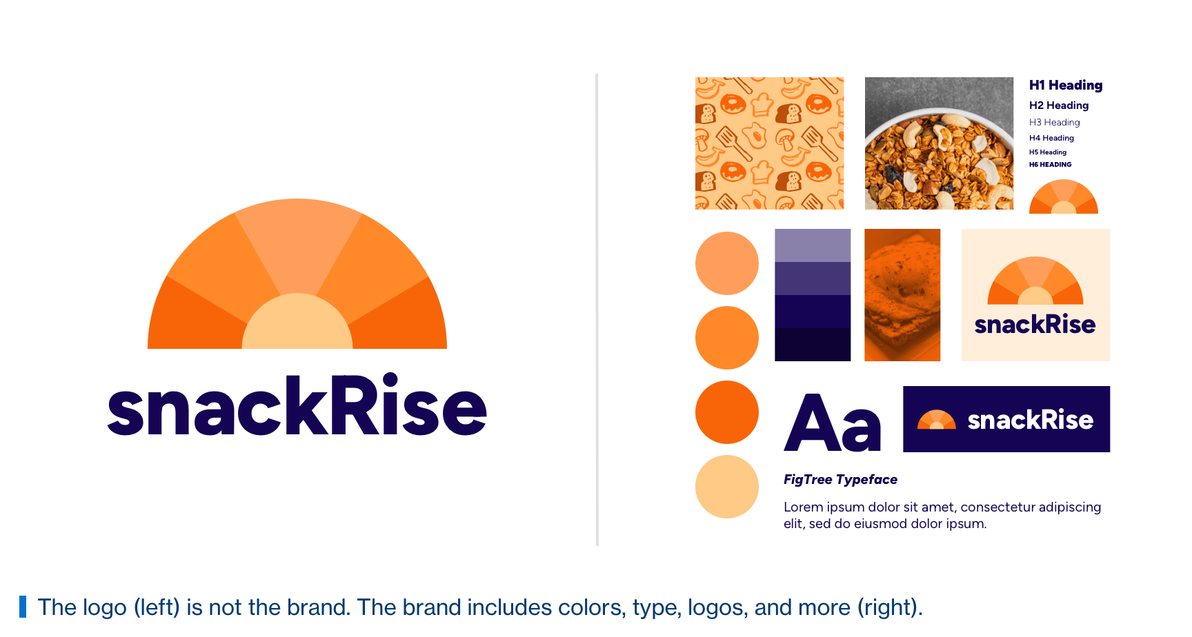
The logo is just one piece of the brand puzzle. The area on the right shows a snapshot of the brand. It's crucial to make this distinction with your brand. Let's say the following two website designs are presented to snackRise.
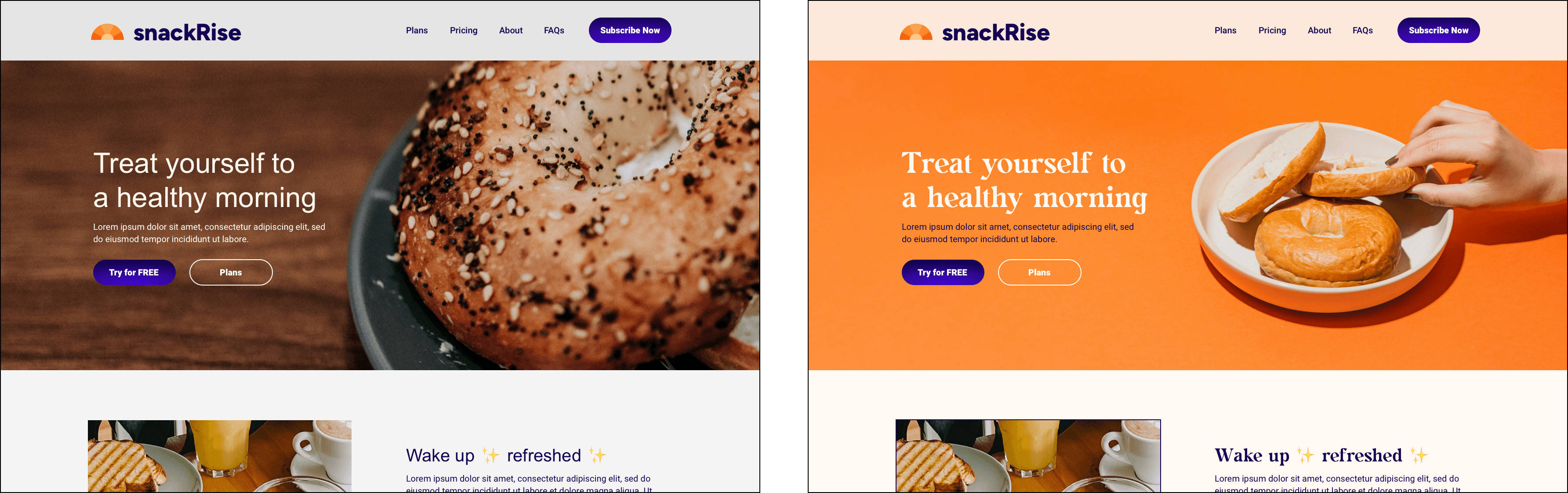
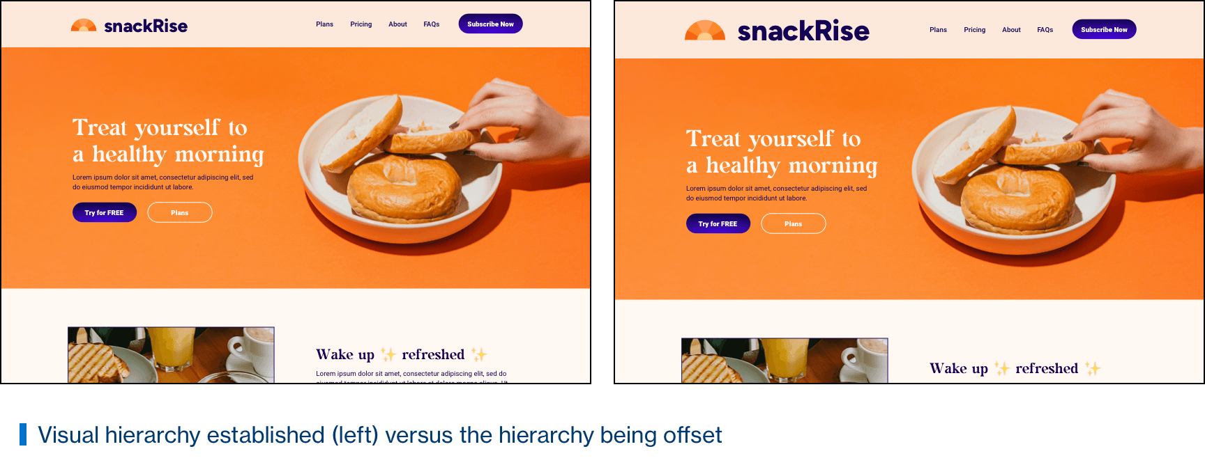
After seeing the website on the left, the client might suggest making the logo bigger. Why is this? The real problem here is the misuse and almost total absence of the brand. Instead of making the logo bigger, the solution would be to create consistency through branding assets. Infuse more of the brand into the design. Incorporate brand patterns and photography. Tell the brand’s story through engaging content written in your brand style. The website on the right exemplifies this.
Now, review the images again, except this time, we have removed the logo.
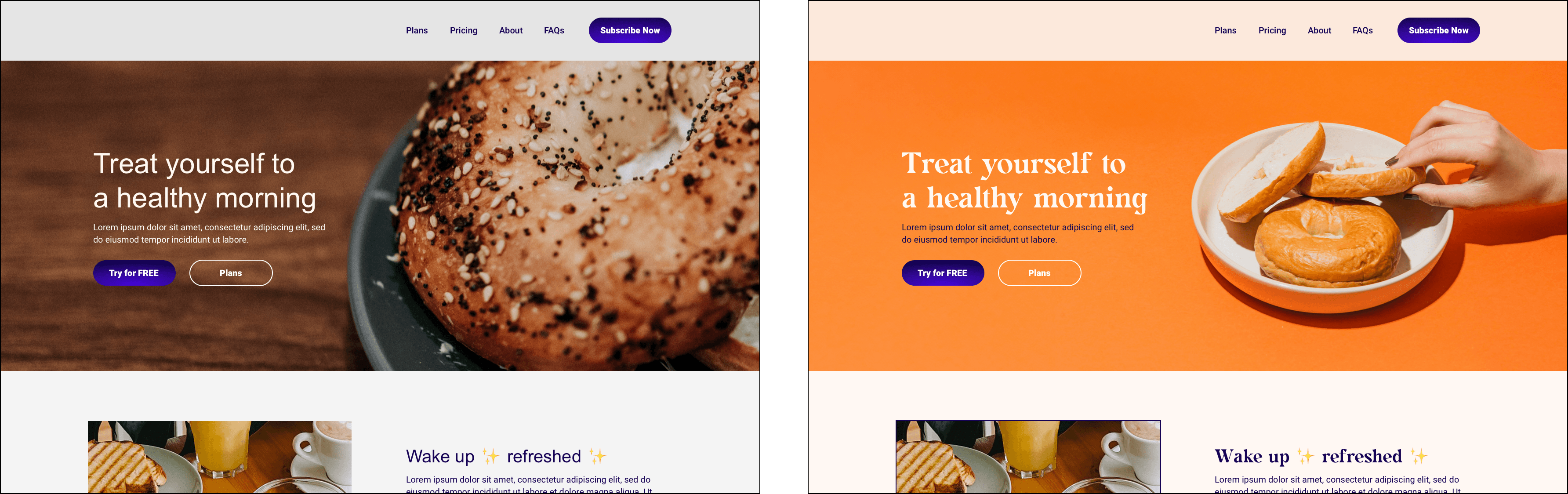
Your website, ad, social graphic, or any other design material should reflect the brand regardless of whether the logo is present or not. Which website would you be able to tell belongs to snackRise? The customer should easily recognize the website on the right belongs to snackRise because this website uses brand colors, type, writing style, etc. The website on the left could be any breakfast company’s website because the branding is not properly reflected. This proves the logo size isn't the issue here, but what the client is trying to communicate is the site doesn't feel fit with their business.
Solution: Develop brand standards (if you haven’t already) and put them into practice. To read more about brands and creating brand guidelines, check out A Guide to Brand Guides.
Reason #2: Trying to Relate to Your Audience
With good intentions, the client is attempting to show the audience their business. They want to get their point across by telling their story and what they stand for. Oftentimes, they try to do this abstractly through their logo, which is inherently good; however, the deep sense of pride in their logo develops so much that when a designed material isn’t quite hitting the mark, the first place they look to make changes is often with the size and placement of the logo.
To get around this, try to connect what the brand stands for with what the audience needs. Your website should be utilized to not only tell your story but also serve as a tool to direct the customer to your provided solution. In doing so, your company will naturally become what your audience wants.
An abnormally large logo takes the spotlight away from your products and services and can allow the user to become stuck on the brand image. Although not a 100% negative result, your solutions should be the ultimate core of the business.
Solution: Prioritize writing quality content and incorporating SEO. Consider hiring a copywriter or marketing agency that can bridge the gap between what you want to say with your brand to the solutions you provide.
Reason #3: You Think Bigger Is Better
A bigger logo = more brand recognition = more money, right? We’ve all heard that the bigger the better; however, this doesn’t always apply to the logo. Making the logo larger within the design might offset the layout and visual balance the designer has created. This should be an instant red flag, as it could turn away visitors to your website.
Balance within a website is the act of making everything proportionate with one another. Users can be quick to notice if something feels out of place. As a business, if your website feels out of place, it can lead to further issues such as distrust in the brand’s reputation.
The space used within a website is critical. Every pixel counts as real estate, and the amount of users that reach the bottom of a webpage greatly diminishes as you scroll. As discussed in reason #2 above, enlarging the logo inadvertently pushes other elements, perhaps services and contact information, further down on the page.
Negative space is another factor to consider. Negative space, also referred to as white space in website design, is the blank or empty space that surrounds elements on a webpage. White space is important for giving the eyes rest and allows the user to focus on the important elements. If the logo is larger than it should be, the amount of negative space is diminished therefore making the navigation feel too tight. If you want to read more about how blank space affects design, read our blog post White Space Isn't Wasted Space.
Solution: As a client, trust the designer. A good designer will thoroughly listen to the client’s request and make a decision based on the client’s needs, the brand, and fundamental design foundations.
Reason #4: The Logo Needs to Be Bigger
The final reason why the logo needs to be bigger is that the logo actually does need to be bigger. In the example below, the logo on the left feels a bit unreadable and disproportional to other elements on the page.

Scaling the logo larger makes the webpage feel balanced.
Solution: Make the logo bigger... slightly.
As designers, our job is to take feedback and figure out the “why” behind the requests. If you need help with logo placement on your website, social graphics, t-shirts, or other application? Email us at info@jhspecialty.com.

