


Chances are you might be reading this post on a mobile or tablet device. If so, you are part of a larger group that is changing the way designers and developers think about building the web. The explosion of smart phone adoption has been an unique challenge for many web designers and developers. When and how to develop mobile sites is an evolving process that we continue to explore here at JH Specialty, Inc.
One of the solutions to tackling mobile design is developing your website with a responsive design approach. I've been reading Responsive Web Design by Ethan Macrotte to learn how we begin to implement this process into our normal project pipeline. Many analysts expect that mobile and tablet devices will be the go-to device for web access. Is your site prepared for this transition?
 The web, more so now than ever, is an inconsistent experience throughout multiple devices and browsers. To help insure a better and more consistent experience, many designers are looking towards responsive design approaches to help create a similar experience between desktop, mobile and tablet browsing.
What is Responsive Design?
Macrotte describes responsive design as a consistent approach where we "treat [both desktop and mobile device] as facets of the same experience... craft sites that are not only flexible, but can adapt to the media that renders them." Simply put, design your site so that it creates a similar experience on your mobile devices as it would on a desktop.
To help designers and developers create responsive designs, Macrotte suggests that we begin to examine three key components: flexibility, grid-base layouts, media queries, flexible images and media.
To tackle these components, designers must design with a MOBILE FIRST mentality. We must discover the more critical concepts and informative of the design. Working with clients, we try to discover the hierarchy of their message. What is the call to action – is it to promote a marketing message? Is the purpose to have people join an online newsletter? Is it about getting customers to buy a particular product?
 These types of questions lead us to discover the "truly critical aspects of our designs" and help create the foundation of a website that elegantly delivers the client's main message. Designing for mobile first allows us to concentrate on the best part of a website and helps eliminate unnecessary information.
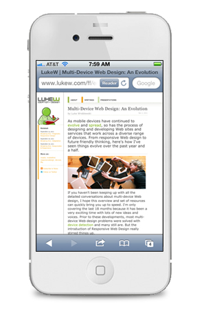
Designer Luke Wroblewski, makes a strong case for mobile first design, "If you design mobile first, you create agreement on what matters most. You can then apply the same rationale to the desktop or laptop version of the website. We agreed that this was the most important set of features and content for our customers and business - why should that change with more screen space?"
Luke makes a great point. Why do we spend so much time designing elements for the desktop web space; just to fill it up? By establishing the mindset of mobile first we can build the foundations for more richer and important content. Mobile first doesn't necessarily mean less information; it just allows us to focus on the information that is most critical.
As a designer, it is my role to help set the tone and hierarchy of how we visually build our digital spaces. This new responsive approach, with mobile first mentality, will allow us to create flexible and dynamic sites across multiple web platforms.
Purchase the Responsive Web Design e-book now!

