


Packaging is the first impression of a business selling physical products. Consumers decide, whether consciously or not, to purchase a product based on viewing the packaging. Decisions can happen from a glance down the grocery aisle or after hours researching your product on your e-commerce website.
As a business owner, designer, marketing specialist, or any other position in a product-based business, how do you know if it is time to redesign your product packaging? What are design aspects to keep in mind when redesigning packaging?

Should you Redesign?
Redesigning your packaging is not always the answer to boosting sales and gaining a broader, more reliable customer base. There could be other underlining issues on why your business is not hitting your sales goals. However, here are common signs that your business should consider redesigning your product packaging.
Your Product Packaging is Outdated
The most apparent reason to redesign your product is out-of-date packaging, making it unattractive to the consumer. Outdated packaging does not refer to the "retro" nostalgic style that is so attractive to millennials. We are talking about the dated packaging that does not look appealing next to your modern competitors keeping up with the times. Outdated packaging leaves your product in the past.
Redesigning your packaging to follow what is trending is not the solution to this problem either. The resolution is developing a design that speaks to your company's mission, goals, and the nature of your product withstanding multiple trends and years, which leads to the next point.
Your Design Doesn't Align with Your Brand Mission
New product packaging, or brand in general, is an effective way to realign your company's mission. If your company stands for being eco-friendly, but your packaging is doing the opposite, it's time for a redesign.
It is significant to know your target audience and product. If your target audience is more reserved and affluent, but your packaging uses bright colors and a bubbly font, redesigning to sleek colors and more structurally sound fonts can be beneficial in attracting your customer base.
Your Product Changed or Business Expanded
Think of it as growing up. You wouldn't wear the same clothes you wore as a child. The same rule applies to packaging. If your business has expanded and you are now offering more products, it might be time to redesign so all products, old and new, stay consistent in design.
Another reason could be your product formula has changed. Has the product changed physically? Are you including more or less in each package? Does your product have different ingredients?
Your Business is Spending Too Much on Packaging
It may seem strange but if you are spending too much money on packaging, consider a redesign. Using more sustainable and environmentally friendly materials, cutting unnecessary corners to more custom fit your product, or discovering new technology to produce your packaging could save money in the long run. Also, using a simplified minimal design using fewer colors can save money when it comes to printing.
Steps to a Redesign
You've decided that you need a redesign. Now it's time to get to work. Here are the first steps to take in your new product packaging process to get you on your way.
Decide the Level of Redesign
Your company should decide if there needs to be a rebrand with completely new packaging or if they should make minor updates to the current packaging. The level of change can often depend on the budget available, which is one of the first places to start.
Know Your Brand
Define or redefine your company's mission, goals, and strategy. If your company does not have a brand guide or brand standards defining the brand colors, fonts, logos, etc., consider creating one. Your designer will thank you.
Content, Content, Content
Write out exactly what content needs to be included on the packaging. Make a concise document of all the information, including logo, title, instructions, nutrition facts, or trademarks. This prevents a lot of back and forth between the designer and client.
Keep an Eye on Your Competitors
Competitive research is one of the most pivotal steps in the process. Knowing your competitors allows you to see where your business can improve and ensures that your packaging does not copy their designs. Make a list of other package designs that you like and dislike.
Consider what your product will look like in the selling environment. Will your product be on a shelf next to dozens of other similar products? Will it be on Amazon among a list of other similar products? Will your packaging blend in with others? How will your product design stand out?
Final Design Tips
- Don't be afraid to keep it clean and simple. Make labels and packaging simple, allowing the consumer to easily evaluate and understand the brand and product.
- Be honest about your product. Do not claim the product does or has something it does not.
- Be eco-friendly when possible. You are saving the planet, elevating your brand, and customers appreciate it.
- Collect audience feedback. Test with actual audiences. Getting multiple sources of feedback improves your product.
Redesigning product packaging is a process. There will be multiple iterations, options to evaluate, and time spent that is many times worth the cost. Don't stop redesigning. Customer preferences will change over the years, and your company must adapt. A long-lasting, successful company isn't afraid of change. They know that their current redesign might not be their last.
One of our recent product redesign projects included teaming with the natural cleaner company Naturally It's Clean. They wanted new packaging that aligned more with their brand. Before, their packaging used heavily saturated colors that made the product feel artificial. Also, the black-and-white imagery showed one use case for the product but did not encompass all of the possibilities for each cleaner.
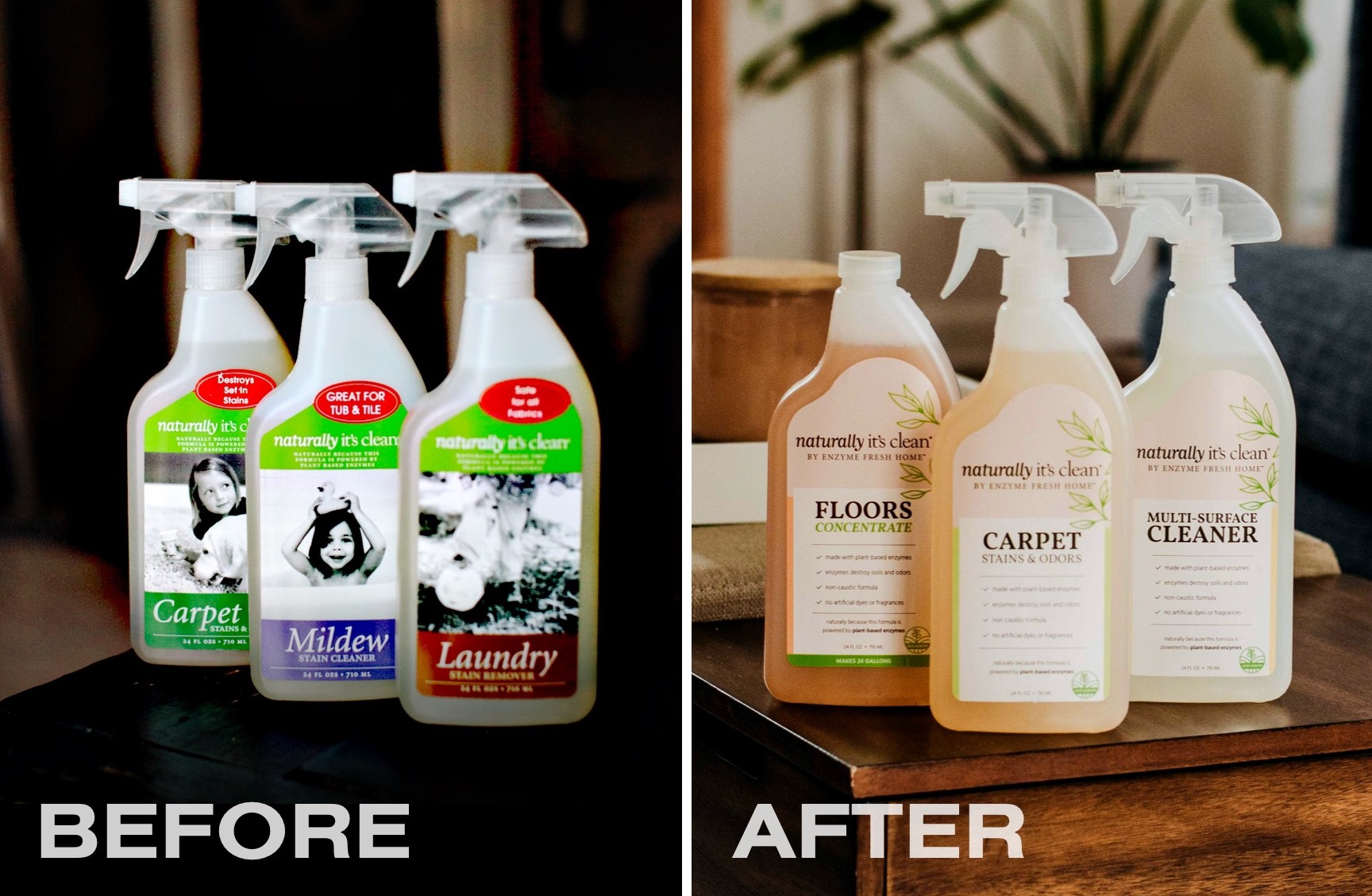
We came up with a line of product labels that better reflected their mission. Using lighter, more natural tan and pastel colors reflect the pure nature of the plant-based enzyme formula. Removing the specific black-and-white photos and replacing them with plant graphics doesn't tie down the product to one use case. Each ready-to-use spray and concentrate is a unique color for easy identification between each product. For these reasons and many other design aspects, Naturally It's Clean can successfully compete with their competitors with an established design emulating their brand and mission to their consumers.
Considering a product package redesign or want more information? We make it simple! Email us to talk about your next project.

