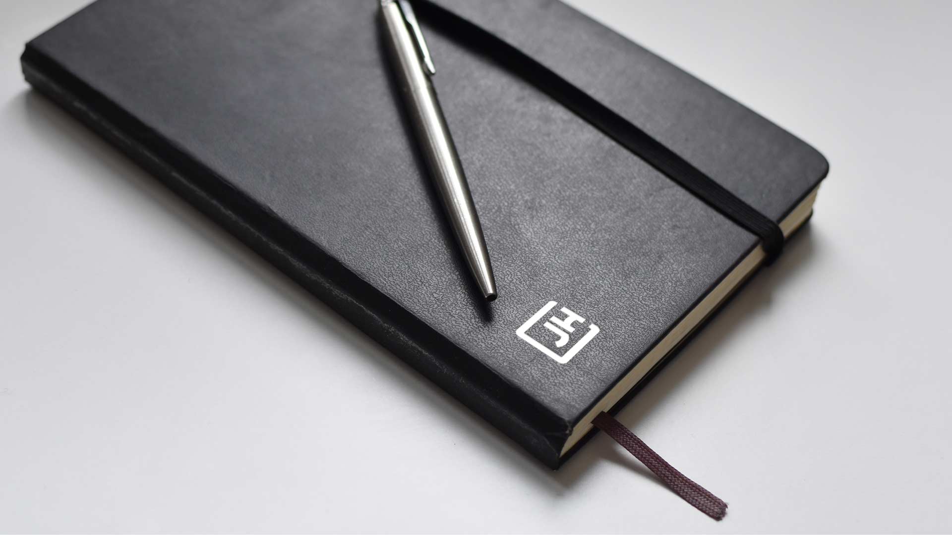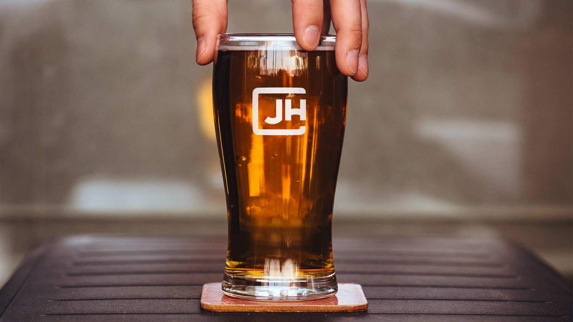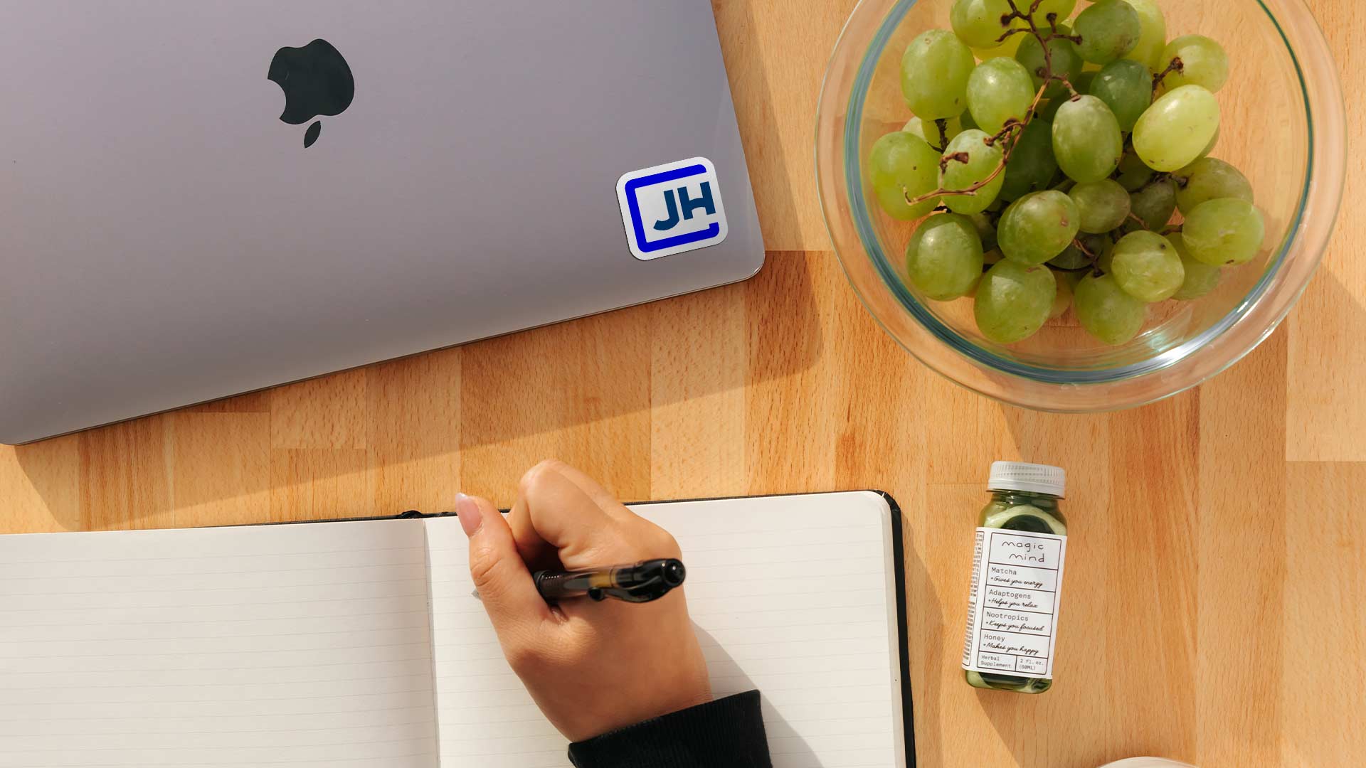
The JH Rebrand
“Hey, can I talk with you for a second?”
For me, this sentence usually means I’m in for it. I tense up. My guts start to churn. My brain kicks into overdrive trying to figure out what I messed up, and how bad the fallout is going to be. When our fearless leader, John Henry, asked me this way back in December of 2019, it was followed up by the words I had been waiting my entire career to hear: “How would you like to rebrand the company?”
In 23 years of doing this graphic design thing, I’d never been picked to do something this huge. For one thing, rebrands don’t come along that often. Secondly, I was never “senior” enough or experienced enough, to be trusted with something that important. Later, as I pushed my bifocals back into place, it hit me — I am senior enough! I have the experience! So, a lesson for the kids there; never underestimate “aging out” the competition as a strategy to get the good work.
Anyway, you aren’t keeping this browser tab open just to read about an old white guy reminiscing about the missed opportunities in his tragic life. How about I explain what went into making this logo and some of the hidden symbolism instead?
The long journey begins.
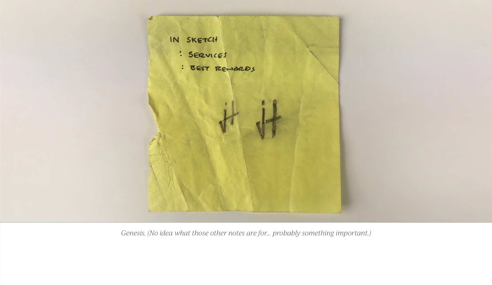
Early in 2020 our fearless leader John Henry casually asked me if I was interested in rebranding the company. I thought about it for almost half a second, before blurting out; “Heck yeah!” About the only constraint, he gave me was it absolutely had to read as “JH”; an aspect where our current logo fell short. I was so excited I scribbled out an idea on a post-it note as soon as I got back to my desk.
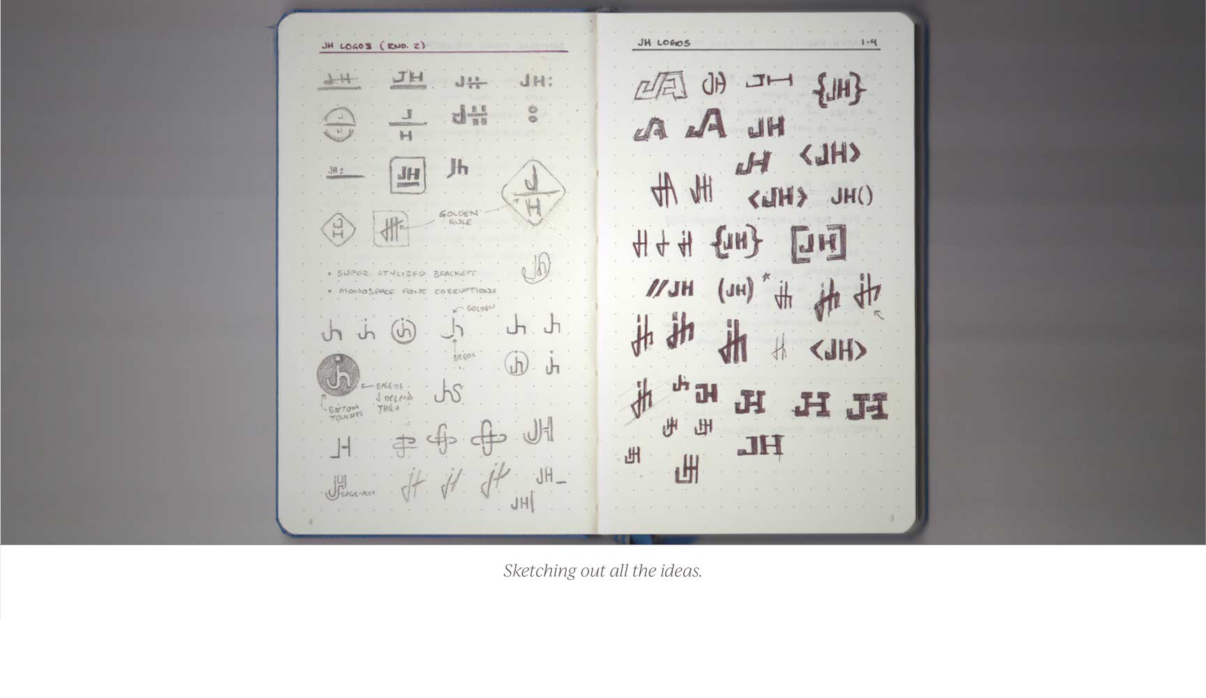
 Over the next few months, I created dozens of thumbnails. There is no quicker way to turn an idea into something real than to put pencil to paper. If you start working on the computer too quickly, you will waste a bunch of time refining ideas you will never use.
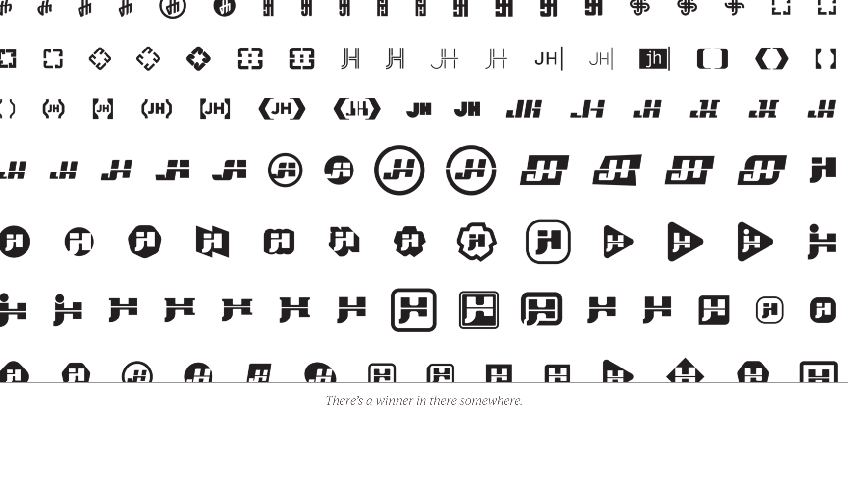
 Once I had some options I was relatively happy with I spent months honing and iterating them in Illustrator. During this phase, there are three guidelines I try to keep top of mind. First, remove anything unnecessary. Second, make sure it’s distinct. Finally, sweat the details. Eventually, I had a logo that checked all those boxes. It was a nice balance of classic and modern; clever and professional.
 It’s worth noting here I had “a” logo ready to present. As a graphic designer, you’re not doing your job if you present a range of options to your client. You’re saying, “I don’t know good design, and I’m not confident in my work. You pick for me.” The main reason you were hired was to make this decision for your client. They are trusting you to decide for them.
At any rate, I had a logo. I put together a deck that gave some background. I pitched it to John, and he liked it too! I’d nailed it. This was going to be huge, and it wasn’t nearly as hard as I thought it would be.
A slight detour.
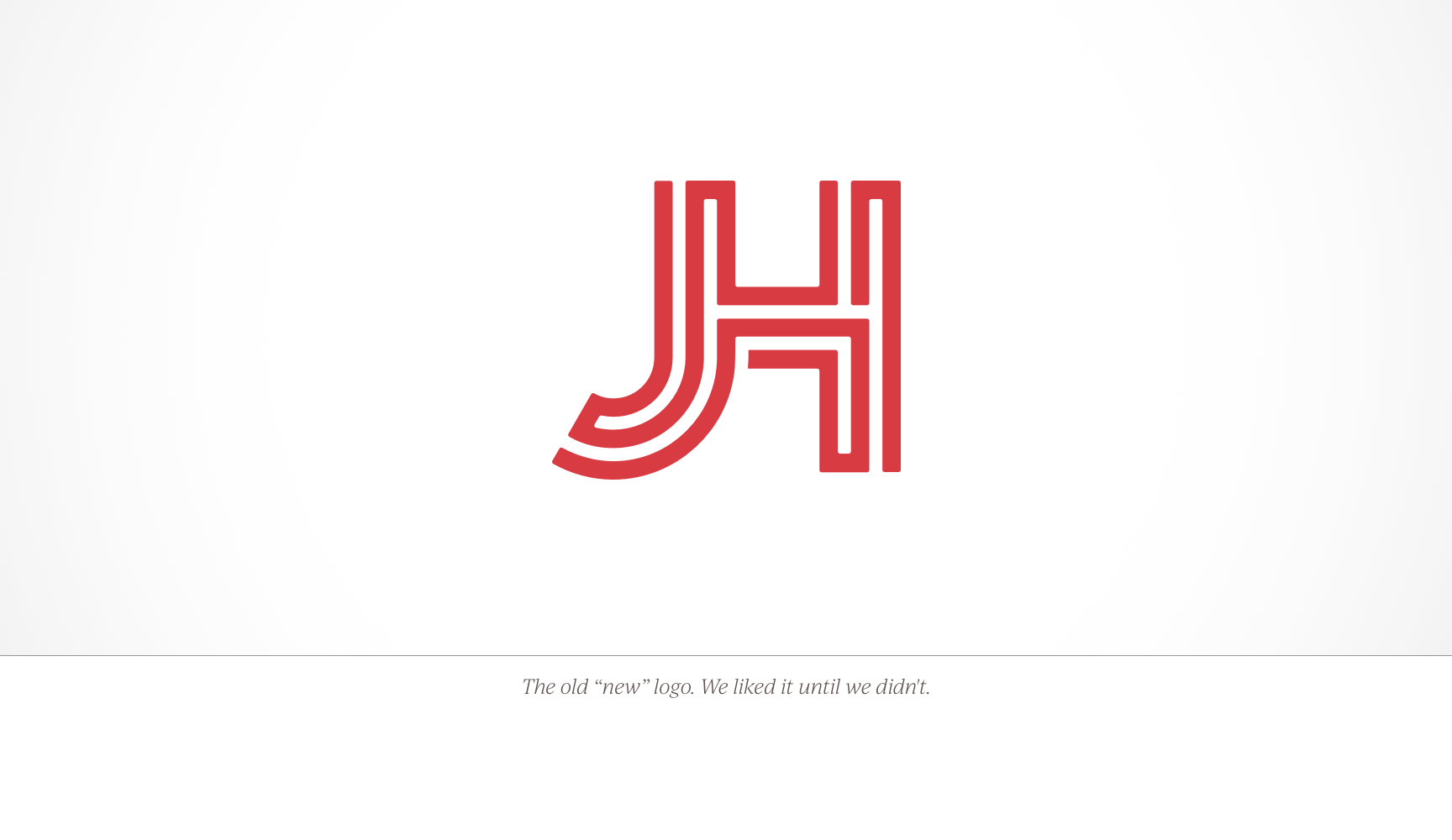
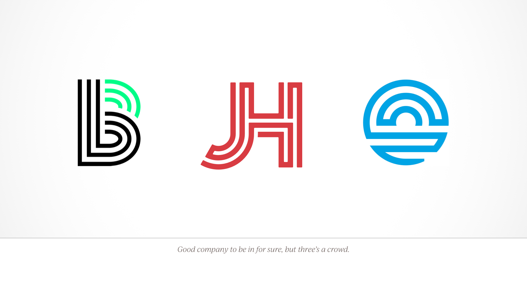
I had designed what I felt was as perfect a distillation of our core philosophy as possible. I had agonized over every aspect of the logo. However, the more I looked at it, the more I began to realize I’d ignored two of my guidelines.
I had gotten so excited about this one idea, I did the very thing I was trying to avoid. I made a [expletive deleted] logo that looked ridiculously similar to the Big Brothers Big Sisters and Riverfront Fort Wayne logos! To add insult to injury, no one read as “JH”.
 After a lot of futile rationalizing, I shared what I discovered with John and we knew what we had to do. It was back to the drawing board. Another four months would pass before we (again) had a design we both liked.
Back on the main road.
The extra effort was worth it though because, in the end, we had a logo that accurately communicated everything we wanted to say about the company.
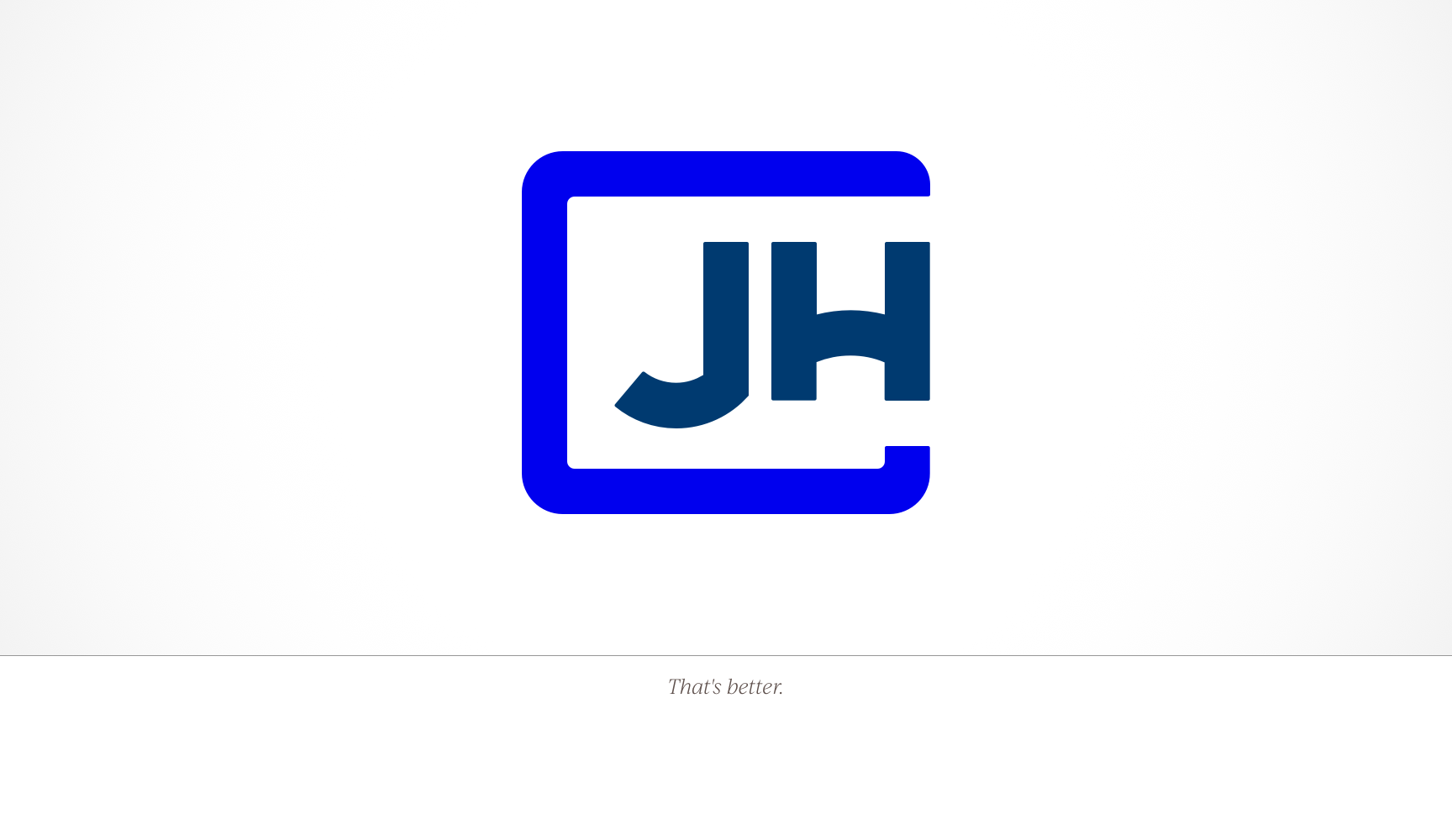
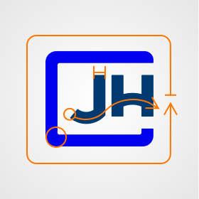
First and foremost, there is no mistaking this for anything but “JH”. I came up with what I thought were many clever ways to make a “J” and an “H” into a logo. Ultimately, they all felt like they were trying too hard to be clever. They weren’t “us”, and JH has never been about pretending to be something more than what it is.
I wanted the logo to be a visual teaching tool as well. So, every design decision was made to represent some aspect of how we approach our work or our company culture. If so inclined, anyone at the company can use it as a way to introduce JH to a potential client.
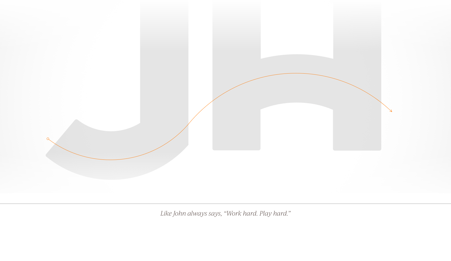
Second, there is “The Wave”. Flowing through the bottom of the “J” and the bar of the “H” you see a subtle waveform. This represents JH at its core; fun and relaxed, but ready to work. The bright blue drives this point home, and because it’s a common color for tech’ companies, helps people start to infer what we do.
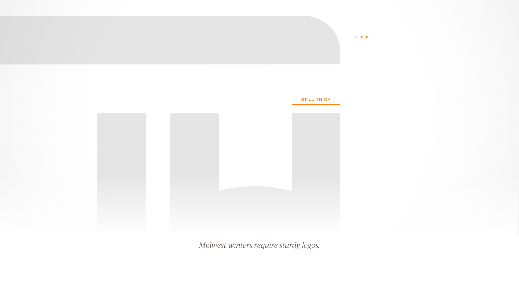
Next, our commitment to quality work, and the fact that we aren’t the new kids on the block, is encoded into the sturdy letterforms. JH has been building the internet as long as Google has been making it searchable (I.e., 1998). The darker blue reinforces the fact that we are established and can be trusted.
The corners have all been rounded off to help emphasize we are friendly and fun to work with. The size of the radius, or its absence entirely in a few key places, is meant to balance the playful with the professional. It’s like John always says, “We work hard, and we play hard.”
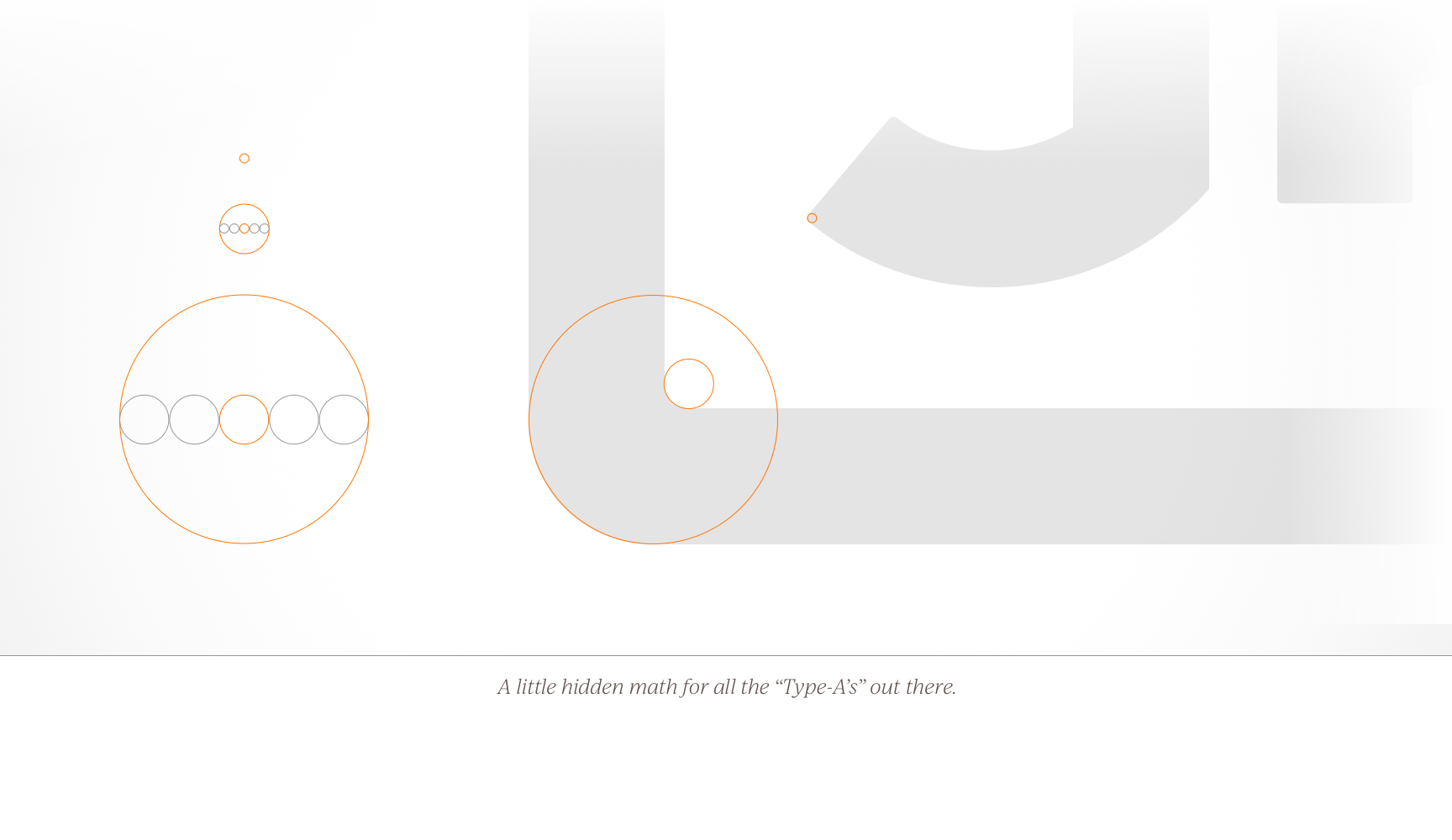
In another nod to our company culture, the radii of the corners are exactly proportional to each other at a ratio of five to one. No matter how much we try to hide it, we’re a bunch of nerds focused on the nerdy details that make our client’s websites great.
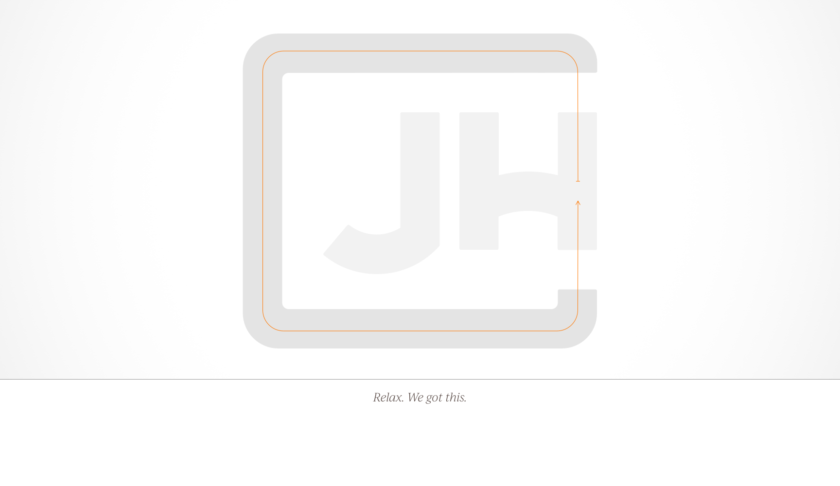
Finally, the blue line surrounding the JH highlights the fact that we are a full-service agency and can take a project from concept to launch. From planning to design, development, support, and promotion; JH will be with you every step of the way to ensure your project is a success.
The journey continues.
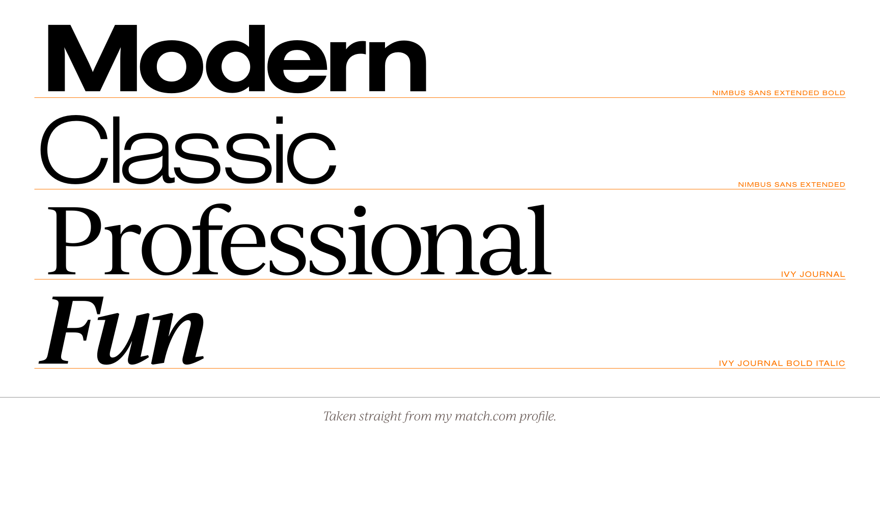
Now that we had our logo, it was time to build a new brand around it. Typefaces would need to compliment the look of the logo and support all the themes baked into it. I love the classic pairing of Helvetica and Times New Roman, but they felt a little too stodgy. After numerous pairings, I settled on Nimbus Extended Sans and Ivy Journal from Adobe. They had the classic proportions I wanted, but feel modern and fresh.
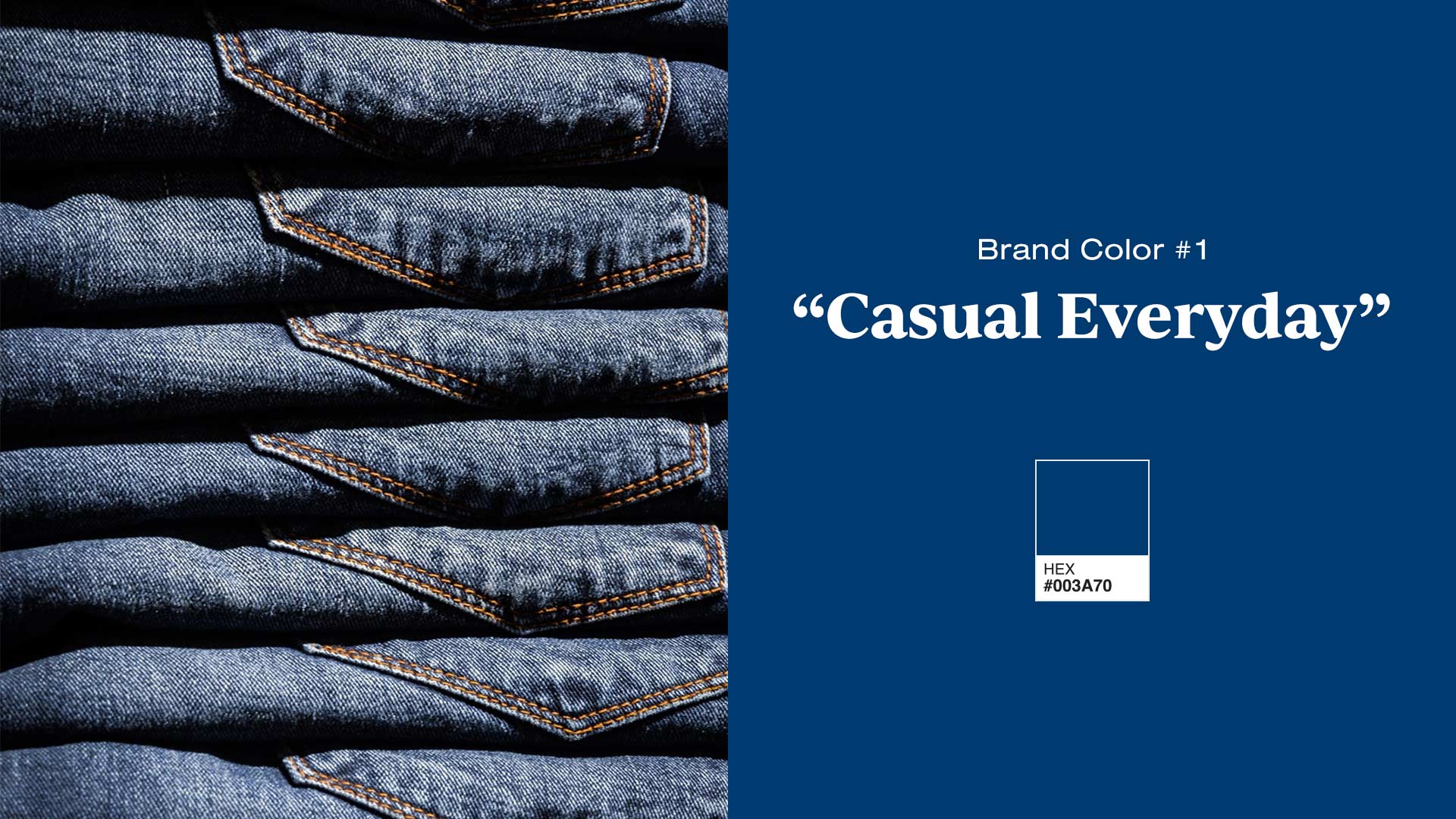
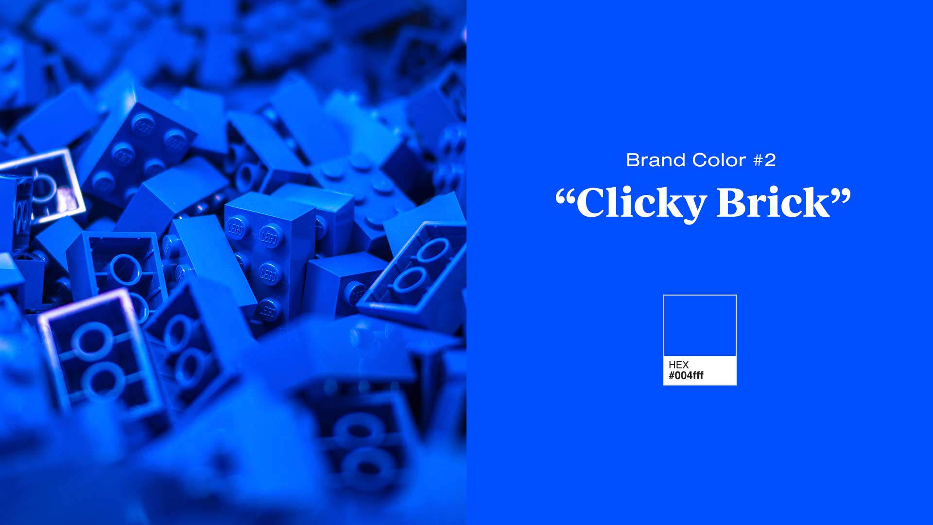
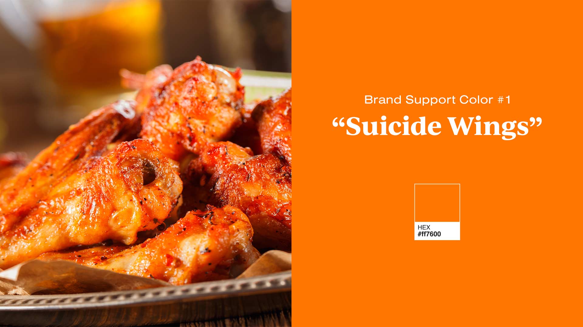
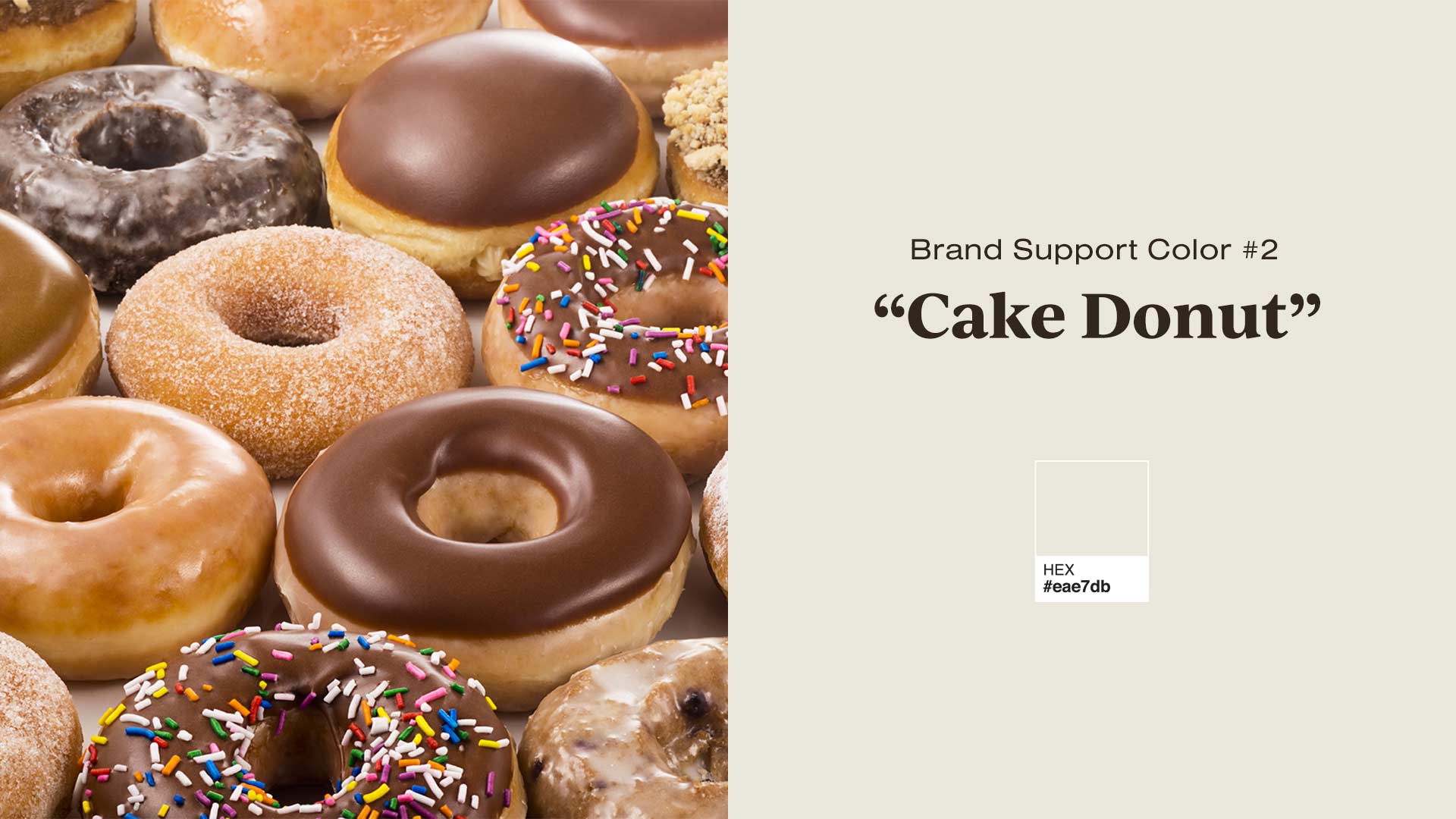
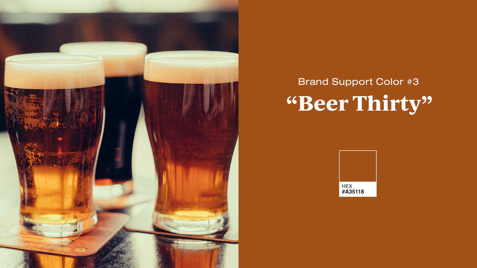
For the main brand colors, I chose bright orange and a more muted orange-brown to compliment the blues. This would give us options to add hits of intense color when needed or have vibrant calls to action on our website. The rest of the color palette is muted so the main branding is the focus. However, a subdued color palate doesn’t mean you can’t have a little fun with the official names. I don’t know how many people outside JH will ever see them, but it’s a fun Easter Egg.
Just getting started.
So there it is; over a year of designing, revising, and agonizing distilled into a logo and a seven-minute read blog post. There is a lot more work to be done to make this a fully realized rebranding. It’s a work in progress as much as JH is a work in progress. The leadership team has put together a five-year plan for the company which promises to open up new opportunities and take us into new and exciting territory. My hope is this logo and re-brand continue to accurately represent the company and reflect our optimism and enthusiasm for what’s next.