


We’re all familiar with the idiom, “Square peg in a round hole,” and understand the point it tries to make. Yet every time we’re online we see logos jammed into tiny circles on social media, or narrow strips of website headers. They are cropped awkwardly and smushed and stretched to fit the space. Why do so many businesses deform their most sacred brand asset into an unrecognizable blob? Can your logo scale well from a giant outdoor ad, to a small navigation bar on a mobile website?
Because conventional marketing wisdom would say that consistency is key when it comes to branding, as a designer, I've found that many business owners are hesitant to let us touch their logos. They want the exact same graphic used everywhere. However, with the advent of so many screen sizes, it is vital to have a branding solution that is adaptable and scalable. Many Fortune 500 companies and large corporations are already doing this, but these responsive logos are so well designed that you may not have even noticed the change. Take a look at some examples below:
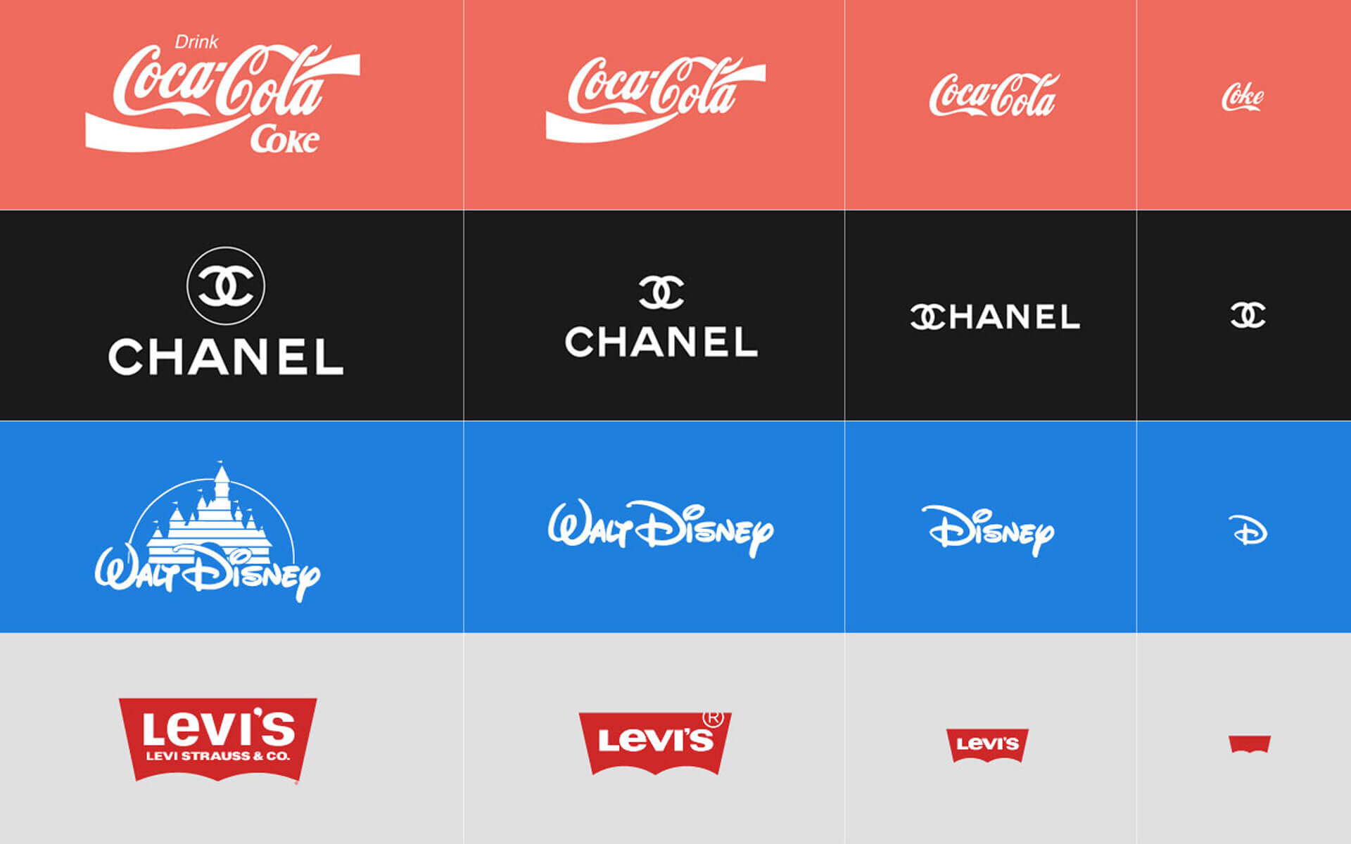
Where there is room for a large-scale logo, the full-detail version is used, but the amount of available space decreases, the logos gracefully simplify. The mobile version may even use just an icon, yet the brand is still recognizable.
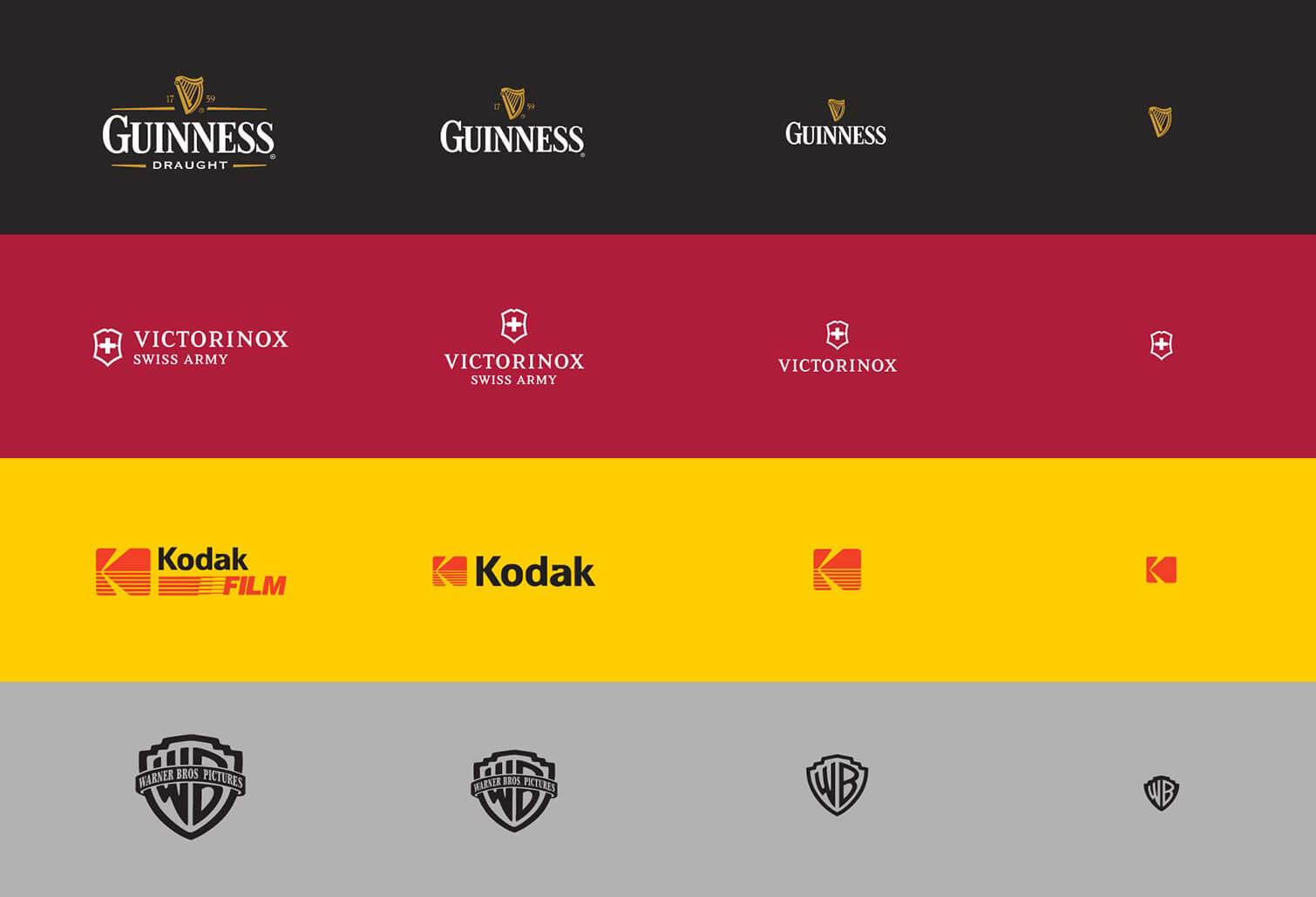
Imagine trying to scale down the full Warner Brothers Logo to the size of the smallest one above. There would be no way you could read the text along the banner. The smallest logo still represents their brand well, without the unprofessional look of too-small text. Brand consistency no longer means blindly putting the same logo on everything. Adapting to context is the name of the game now.
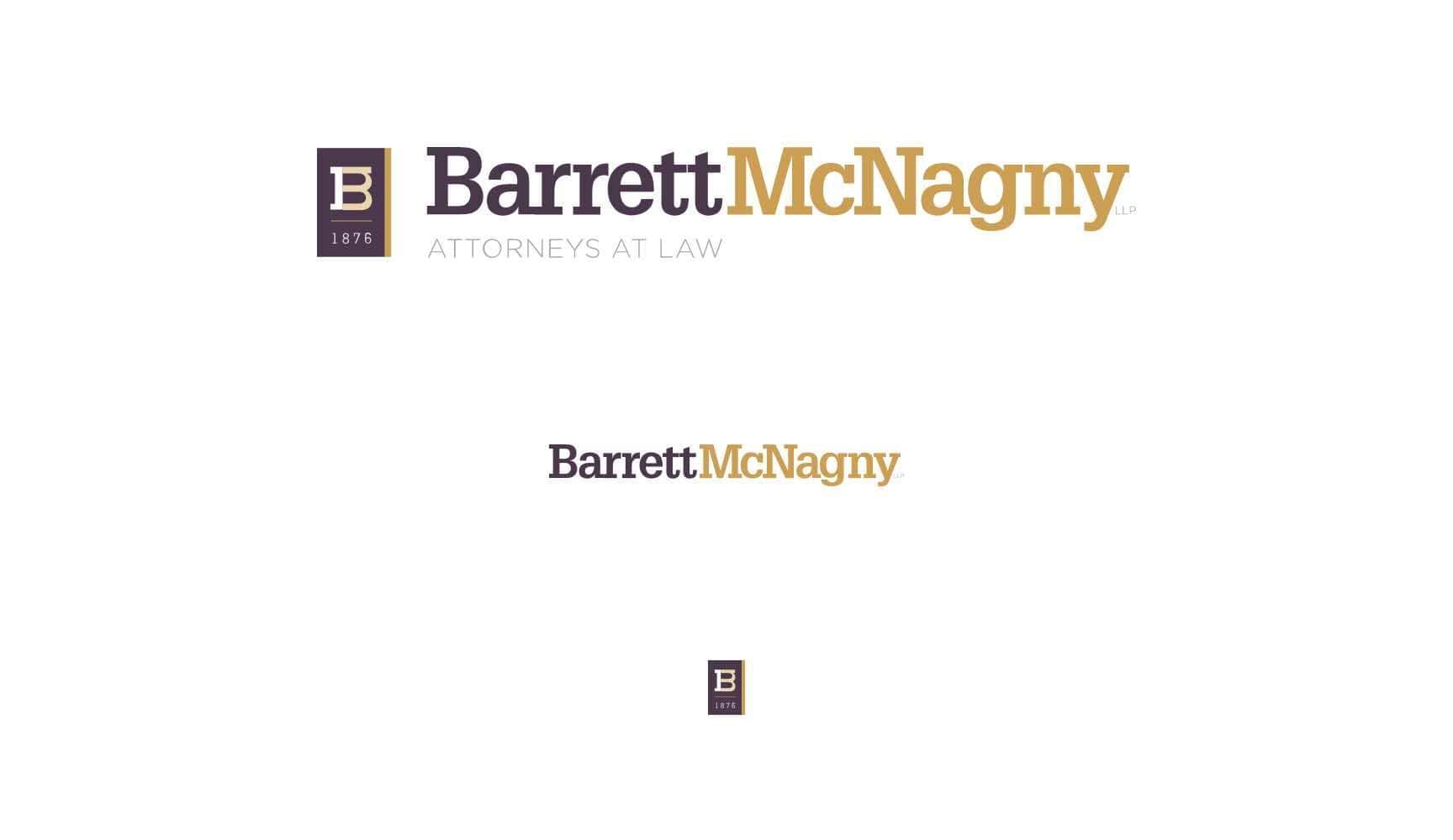
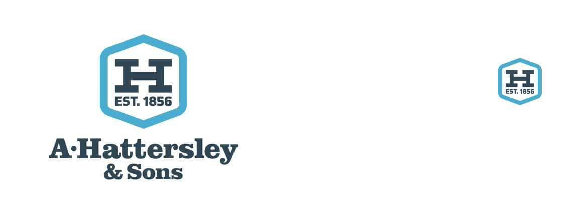
At JH, this is something we try to take into account with every site we design. Some logos already scale gracefully on a mobile phone, but here are a few examples from our clients that have done well with responsive branding:
If you're having issues with your logo scaling, there are a couple things you could do:
- Consider a full re-brand. if you're already in need of logo updates for mobile, it might make sense to get a fresh revamp to your logo. Make sure to specifically ask the company or designer you're working with to create a logo that can be scaled to work on mobile.
- Have a mobile version created. If a re-brand is too much, have a simplified version created from/based off your existing logo. This might work with some logos a bit better than others. For instance, if your logo is primarily text-based, it might be a little more tricky to come up with a good solution that can be abbreviated or turned into an icon.
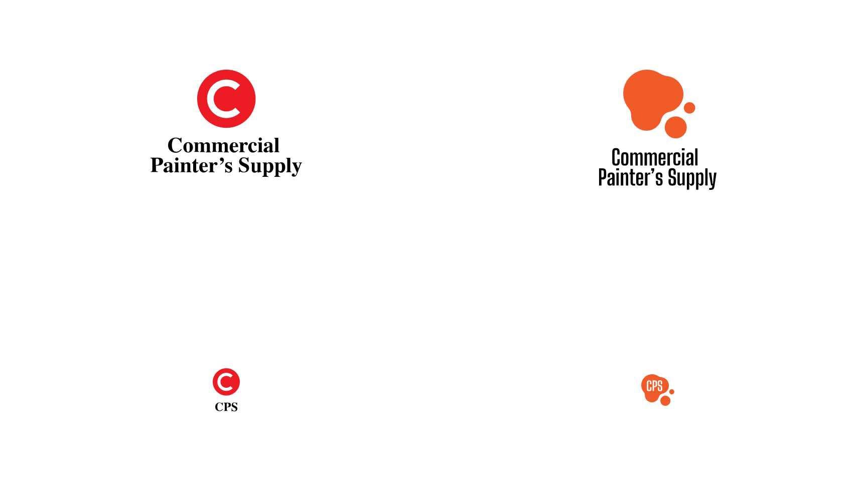
Remember to think about your brand colors and type as well. Choosing a color and type face that are out of the ordinary greatly increase the chances your logo and brand will still be recognizable even if they are reduced to the absolute minimum. In this example a generic red circle could be for any company when shrunk to the size of a social media profile image. The bright orange paint splotch on the other hand, still reminds the viewer of the full version of the logo.
No matter what you decide, the best way to start is by talking to the company or designer you want to partner with to see what's possible. Contact us today for help bringing your logo and branding up to date - we would love to work with you!
Photos screenshotted from Butler Branding Agency
Originally published July 20, 2018 and updated August 9, 2023.

