


In my twenty-six-year career, I can count on one hand how many logos I have created for companies. Only a few of those have been for well-established companies. These projects are rare because so much is riding on a good logo. They immediately and unconsciously influence customer decision-making. A good logo alludes to trust and reliability. It works to put the customer at ease by assuring them that this is a good company to work with and their product or service is reliable.
No pressure then when A. Hattersley & Sons came to us for a new logo and website. For 160 years, they have worked the toughest commercial HVAC jobs and delivered the highest quality workmanship. Yep, I was not nervous at all to roll up my flannel sleeves and design the logo that would have to represent this legacy and help them move into the residential side of the HVAC world.
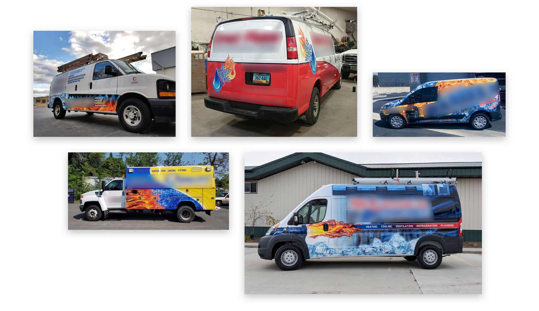
Fireballs & Blizzards
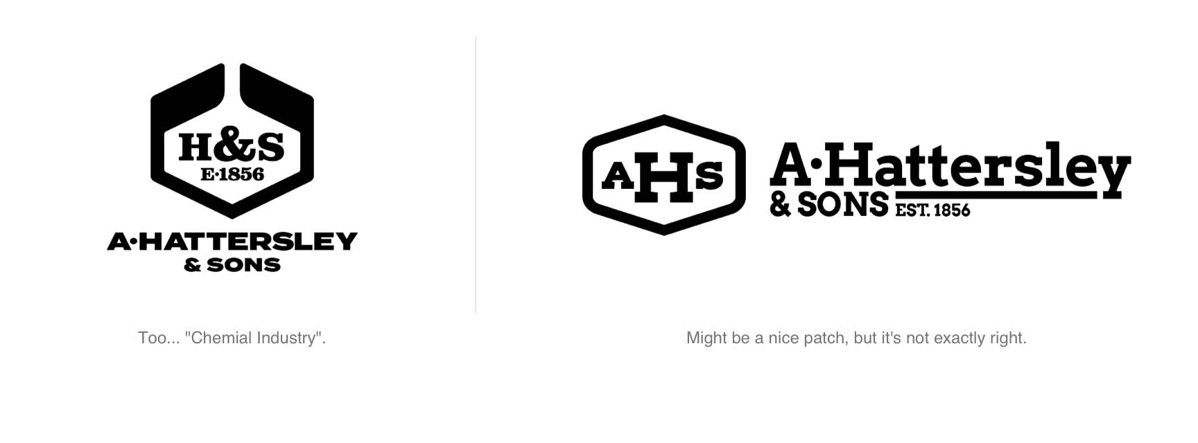
Hattersley’s current logo was about 10 years old and not well liked within the company. They felt it didn’t do a very good job of representing their history, high quality work, or in fact, what their company did. It was so generic it could pass for a law firm, accountant, or even a dentist’s logo.
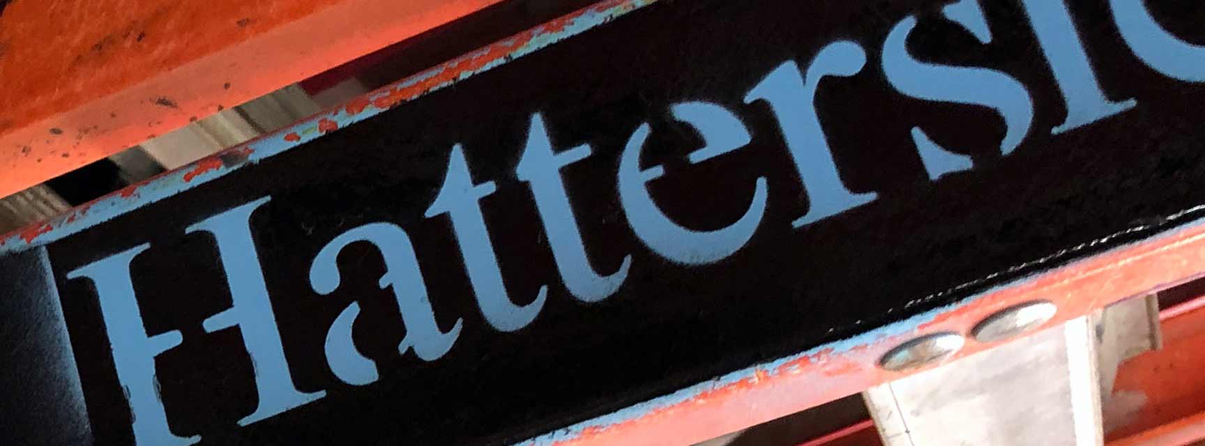
Their long name was something they wanted the new logo to address as well. Neither they, nor their clients, called them “A. Hattersley & Sons”. Everyone just called them “Hattersley”.
To differentiate themselves from their competitors, they wanted their new logo to instill a sense of trust and attention to detail. Their existing commercial clients needed to feel assured that Hattersley were still the 30-million-dollar company capable of completing large commercial projects. New residential clients would need to feel they were getting commercial-grade quality at a fair price.
Like all the best clients, they did not have any weirdly specific mandates on the design. (A friend of mine was once ordered to not use purple on a brochure because the client hated the Minnesota Vikings.) Hattersley’s only wish was that it be professional and restrained.
“Restrained”. Not a word that comes to mind when you think of HVAC graphics. Usually, it’s all fireballs and blizzards splashed across the sides of HVAC trucks. Ironically, as our client pointed out, exactly they type of things you do not want coming out of the vents of your home!
Midwest Is Best
With that I started the design process by looking for inspiration in design books and photos I had taken of logos I liked. I instinctively lean toward a mid-century modern / industrial look because it feels sturdy and timeless. Being a well-established industrial-type company, I felt this style would conjure the kinds of mental images (e.g., legacy, a strong Midwestern work-ethic, etc.) Hattersley wanted to communicate.
The thick lines and simple geometric shapes are timeless and often still look modern today. If I did this right, Hattersley’s new logo would still look good 10 or 20 years down the road.
“H” is not for Handlebar Mustache.
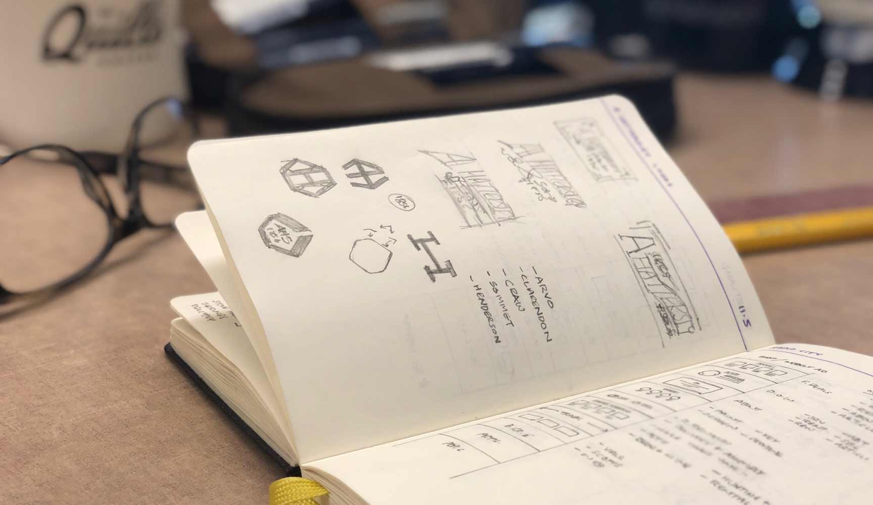
I always start a new logo by sketching. It’s still the fastest way for me to work up a lot of ideas and explore a range of options. This time though, I didn’t do as many sketches as I normally would because some of the basic design foundations had already been laid.
Initially, we were only contracted to redo the website and the idea of a new logo came up in our first planning meeting. I showed the client a few possible design directions at a follow-up meeting. They liked one that drew its inspiration from well-known industrial brands and was an evolution of their current logo. We all agreed this was a smart approach as it says you are improving on a good thing, not reinventing the business after 160 years.
I explored the steampunk aesthetic that is being applied to too many brands right now. As soon as I drew it, I knew it wasn’t going to work though. I didn’t want Hattersley’s customers to think a man with a handlebar mustache, and sporting a flat cap and sooty overalls, would be showing up at their door.
I did like where fitting the “A” and “H” into a hexagon shape was headed though. Not only is it my favorite geometric shape, it’s one you see in the tools and fittings commonly used in the HVAC trade.
Vectors Are Free
Feeling like I was headed in a good direction, I fired up Adobe Illustrator and explored every way I could think of to use their initials and a hexagon. As Aaron Draplin once said, “Vectors are free. So, don’t be afraid to fill up that big old artboard with them.”
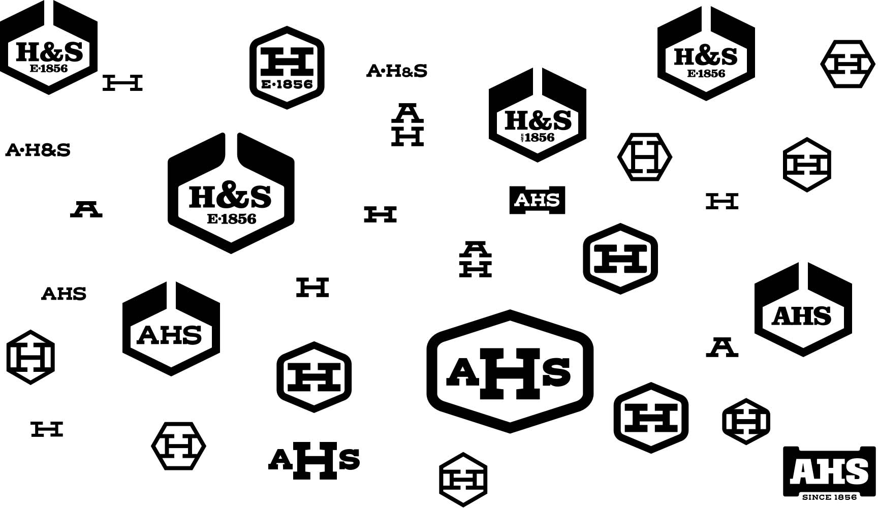
Some are more radical than others. Some are clear failures of proportion and form. Show your work folks — warts and all. You’ll never learn more than when you make mistakes.
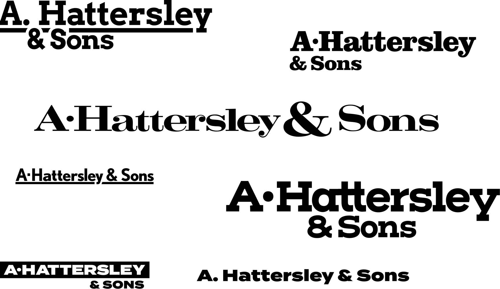
Once I felt like I had some usable options, I started to explore typefaces. For the logo I focused in on slab-serif typefaces. (e.g., typefaces with thick serifs.) For the typography of the word mark I wanted to explore what would balance out the heft of the logo. Some typefaces were too old-fashioned. Others came off a little too generic, too bold, or (again) just missed the mark entirely. The important thing at this stage is to see them all together. It’s the only way to determine which options work best.
Stick To Your Guns
After some more fiddling, I had some combinations that I felt were presentable. However, pause for dramatic effect... presenting options *(plural)* to the client is a big mistake. The mark of a true professional is having enough confidence in your skills to present the logo you think is best. Make a presentation deck that shows your work and walk them through your design rationale. Keep that good second and third choice in your back pocket for now.
If your rationale is sound, the client will like what you’ve come up with, and you’ll be golden. If they hate it, you’ve got your back-up options and you’re not starting from scratch. With new feedback from the client and a little work, you can quickly work up something they will like.
In this case, Hattersley felt we were really close and just wanted to see a few minor tweaks and color options. Here again, being the professional, it was my job to tell them which of their ideas were good, and which weren’t worth pursuing. If you do everything a client asks and completely compromise your work, you’re not a designer. You’re an order taker. A cake decorator.
Symbolism & Spray-Paint
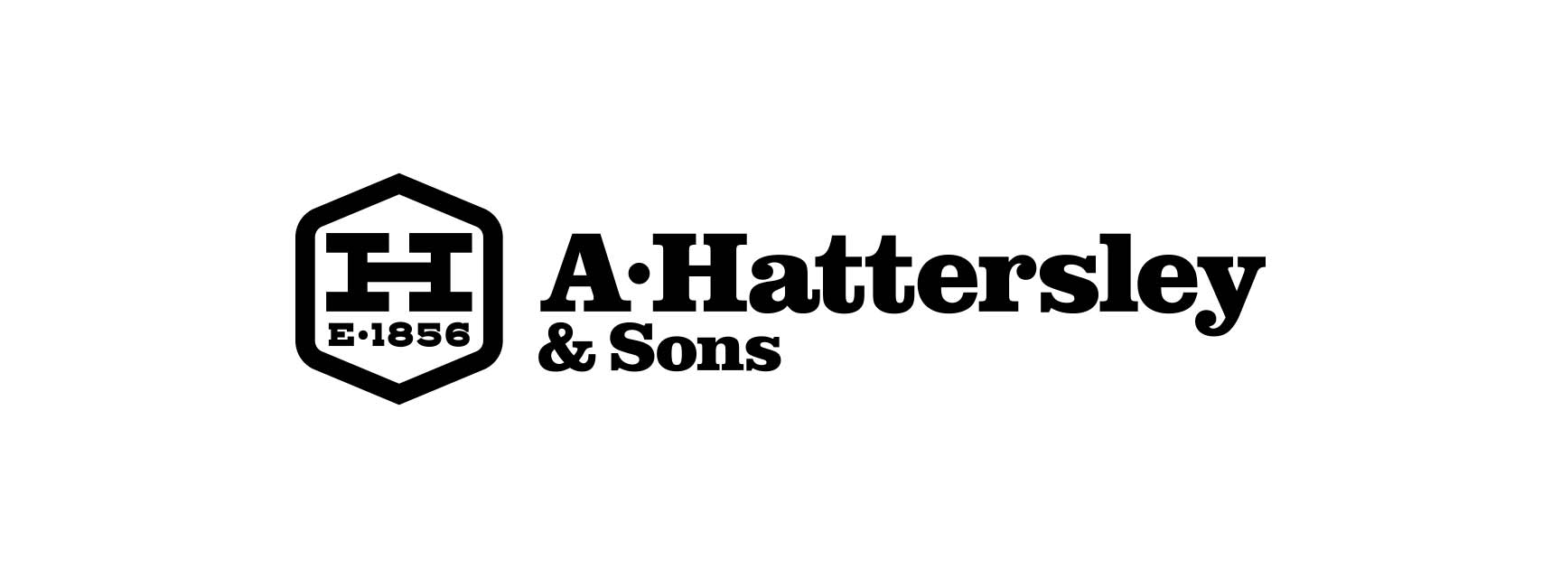
The final version, while not a huge departure from the original, does a much better job of communicating the high level of work Hattersley strives to provide. It looks industrial like an HVAC logo should. It looks like it’s been around for a while, but not old-fashioned. It’s solid; implying reliability and quality.
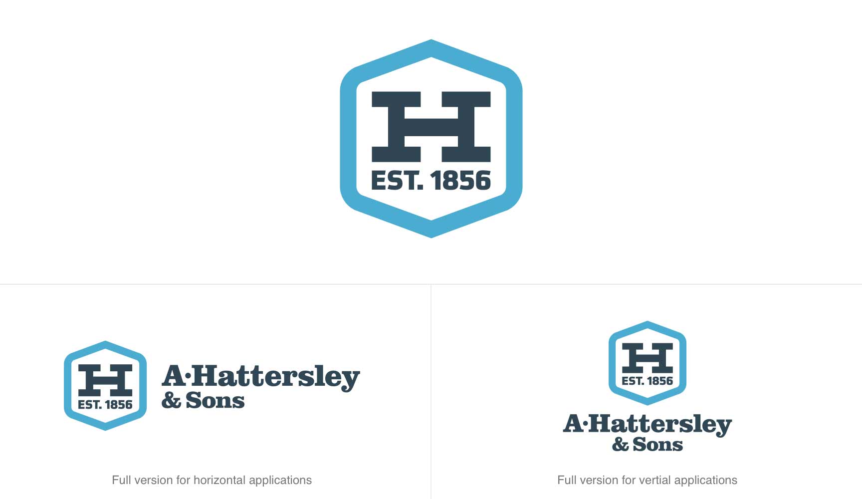
The hexagon has been beefed up to emphasize Hattersley’s reliability. I turned it on its point and softened four of the corners to speak to their craftsmanship and attention to detail. The “H” looks like a well joined set of pipes. It rests on “Est. 1856” implying a strong foundation of doing business the right way.
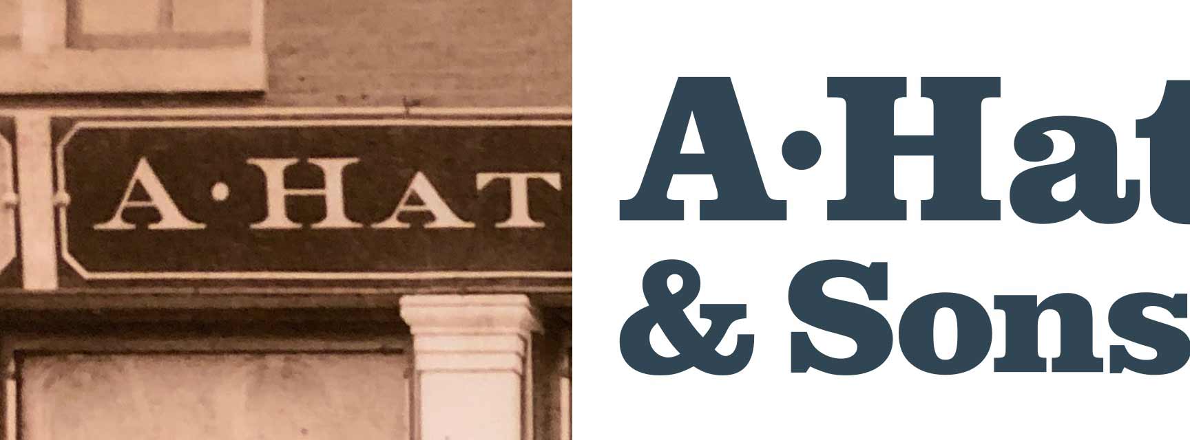
The final typography of “A. Hattersley & Sons” was inspired by their signage from the early 1900’s. It’s not as fancy as the original, but this typeface (Clarendon URW, if you were curious) feels like a nod to the past while bolstering the reliability and modernity aspects of the company. I especially like where they placed the period between the A & H on the vintage sign, so I decided to include that little detail in the new version.
The final color way was influenced by two factors. The first was because I was designing the website while finishing the logo. The second factor was (like always) a spray-painted ladder.
I didn’t want to go with red, white, and blue because it is virtually ubiquitous in this industry. However, when you are working in heating and cooling, and are over 160 years old, there aren’t many other solutions more fitting. In a bid for some uniqueness, I darkened and de-saturated the colors to push the historical aspects of the brand. I also came up with some fun sounding blue collar names for them; “Busted Knuckle Red”, “Coverall Blues”, and “Work Order White”.
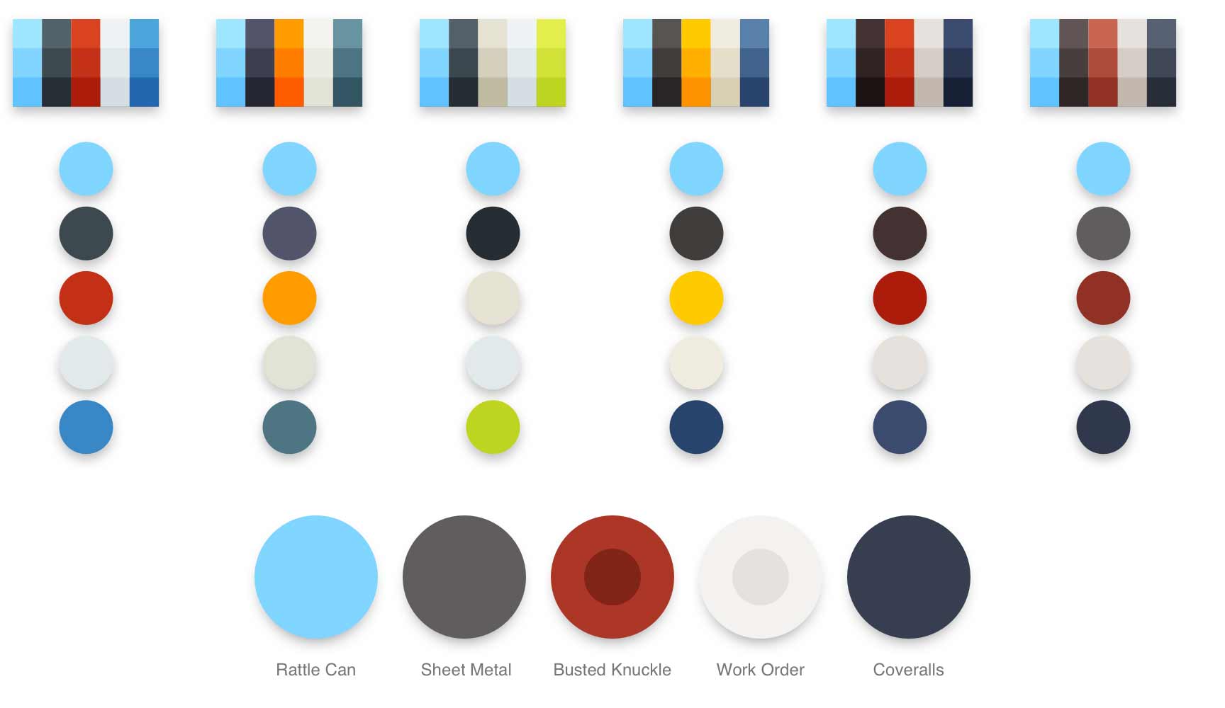
However, there was also that spray painted ladder to consider. To prevent job site thievery, Hattersley stencils all their equipment in baby blue. Because this color was familiar to their clients, it seemed smart to incorporate it into their new branding.
After some minor tweaking it became the basis of the entire color way. Ironically, most of the decision making around brand colors would not be made by a graphic designer who studied color theory. It was done by a random employee grabbing the first can of spray paint they could reach so a ladder wouldn’t be stolen!
The Website
With the logo close to being locked in, I could dive deeper into the website. The direction from the client was similar to that for the logo. Commercial customers should feel confident Hattersley was still the same reliable company they were used to working with. Residential customers should feel they were getting commercial grade work for a reasonable price.
In general, I wanted bold headlines, clear calls to action (i.e., buttons and links), and a good amount of space between the blocks of content. This would make the site inviting and easy to scan for information. On interior pages, leading (the space between lines of text) is increased to make reading easier.
All Roads Lead to Content
To accomplish this, I recommended a couple of things for the prime real estate at the top of the page. The casually browsing residential customer would need to have a good first impression of Hattersley and want to keep scrolling. Residential customers with an emergency on their hands needed obvious paths for fast help. Finally, commercial customers would need to find their specific info easily.
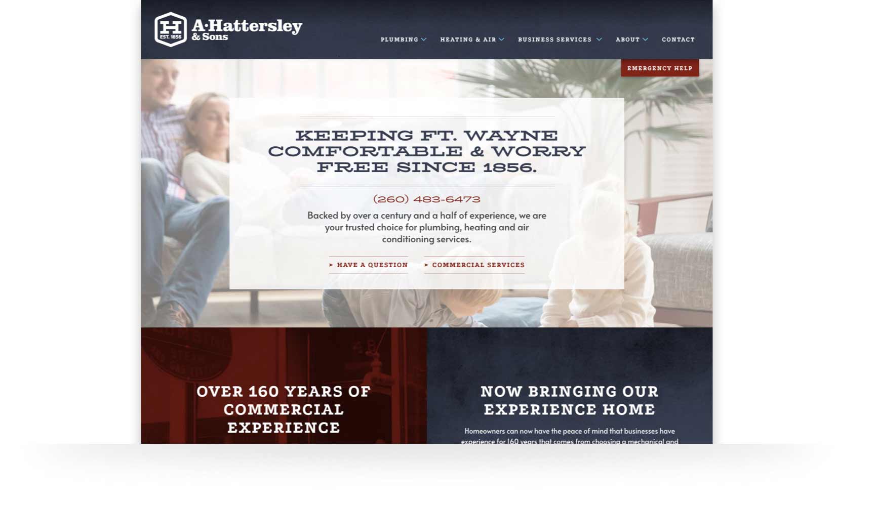
To that end, there is a cozy lifestyle photo, messaging and contact info for homeowners. We also made an “Emergency Help” button to always be easy to click from anywhere on the site. There are also two links to their commercial services. While subtle, I placed them roughly where they were on the old site to make it easy for commercial customers to find their info.
The next section intentionally peaks up from the bottom edge of most browsers. A short scroll explicitly lays out Hattersley’s depth of knowledge and experience in the commercial sector, and that it’s now available to residential customers. Customers have the opportunity to dive deeper into content specific to their need or keep scrolling for more top level information.
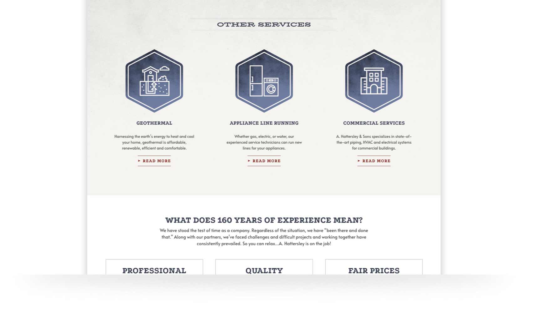
At this point, visitors are roughly at the half-way point of the home page. Typically, the majority of people still scrolling are most likely deciding if this is a company they want to work with. For this reason, I placed information about their services, values, history, and work in the community. Like the links to blog posts that follow, it’s not critical information, but it is the type of content that can get a visitor to pick up the phone and become a customer.
Once you have a visitor on your site, it’s critical to keep them there. If they can’t find what they are looking for quickly, they leave and are gone forever. To mitigate this as much as possible, I made sure people had many roads to the info they were looking for. As a kind of safety net, the page ends with a simple form as an easy way to ask a question directly to a Hattersley employee.
Words & Pictures
It goes without saying the design of the site needed to support the logo. When it came to choosing typefaces, I was lucky to find a couple that looked strikingly similar to the ones used in Hattersley’s signage over 100 years ago. They do an excellent job of looking vintage, but not old-fashioned. These were balanced out with some more modern and industrial typefaces for the body copy. As you can see, I tried as many versions as necessary to get something that looked right.
Graphically, the site is fairly light. Icons, buttons, and photography were chosen to appeal to commercial and residential customers, support the content, and not look too “stock”. A tougher balancing act then you might think!
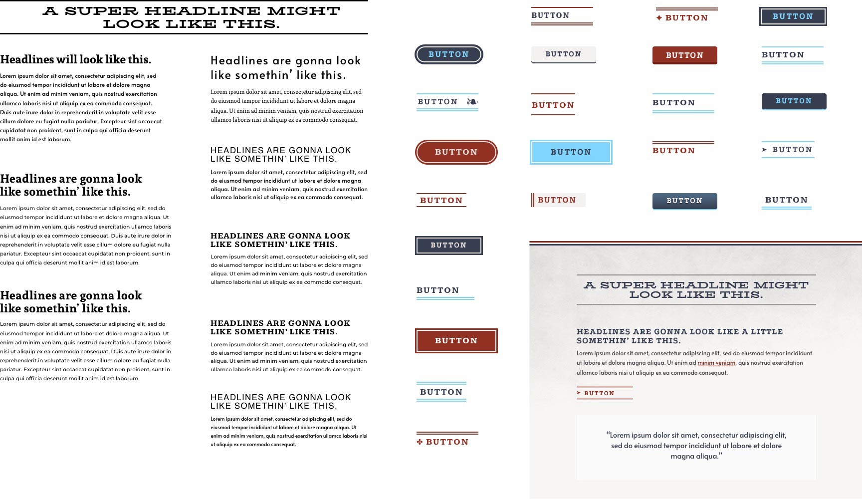
I took special care to make sure the site did not end up looking like a Fourth of July parade. The pages needed to quietly suggest patriotic pride, not shout it. Many of the key elements on the page like the main menu and service icons are blue to draw some attention to them. Red is reserved for only the interactive elements and sections of particular importance. Finally, I put a subtle paper texture in the background to keep the site from feeling too flat and generic.
Conclusion
These two projects were challenging, but a lot of fun to work on. Having a great client like Hattersley who gives you space to do your best work was crucial. The job would not have been the success it was without the outstanding company culture and leadership at JH Specialty as well. Great design is never the product of one person, alone, toiling away in their basement. It’s the result of all the participants on the project working together, and each of them being able to contribute where their talents are strongest.

