


Bishop Dwenger Re-Re-design
JH has been fortunate to consider Bishop Dwenger High School a client for many years. Recently, we were asked to redesign the school's website for the third time. Since the second site launched in 2015, users have increasingly been accessing the website from their mobile phones rather than a desktop computer creating a growing concern.
In 2015, 37% of visitors were using a tablet or phone to access the website, so having a "desktop only" site wasn't a huge deal to the school's administration. However, over the last six years this number dramatically increased:
- 46% in 2016
- 53% in 2017
- 56% in 2018
- 62% in 2019
- 65% in 2020
Having a mobile first web design was imperative heading into 2021. The Bishop Dwenger team reached out to JH for a visual and functional refresh.
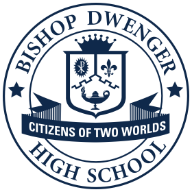
2015 version of Bishop Dwenger website
But first, some research.
You can’t make informed design decisions until you know who you’re designing for and why they need the website. Before we started pushing pixels around, we looked at the site's analytics. This basic research phase confirmed some of our assumptions, but uncovered a few surprises too.
Parents and their kids are the primary visitors, no surprise there. However, a significant portion of visitors appeared to be the parents of prospective students researching to see if Bishop Dwenger was a good fit for their kids. Finally, there was the faculty and staff to consider, although most of their interactions were limited to accessing some quick administrative links on the site.
From the parents' perspective, it seemed their primary driver of their online behavior was centered around information they weren't getting from their kids. As a parent, we've all gotten that industry-standard kid response of “Nothing.”, to every parent’s most asked question; “So, what’s new at school?”. Content and pages surrounding event dates, supply lists, how to contact their kid’s teacher, and if jorts are a dress code violation were in high demand. In other words, information to help them plan their week and avoid missing work to drop off pants.
For students, there were several e-learning links that needed to be easily accessible. They needed to be able to check-in, get assignments, and contact their teachers on a regular basis. Of course, critical information like school delays, and if it was pizza day in the cafeteria, had to be a top priority!
There were a couple of other broad considerations to account for as well. We didn’t want to “move anyone’s cheese” to paraphrase a common design adage. With a new school year imminent, parents would not have time to look for information that was, “Right here yesterday!”.
Finally, because the majority of users came to the site on mobile, screen space would need to be used wisely to provide an appealing, yet content-rich, experience while ensuring the site loaded quickly while in car line.
“Our Lady of Victory, pray for us!”
— Chet Ripley,
The Great Outdoors
Arranging all the pieces.
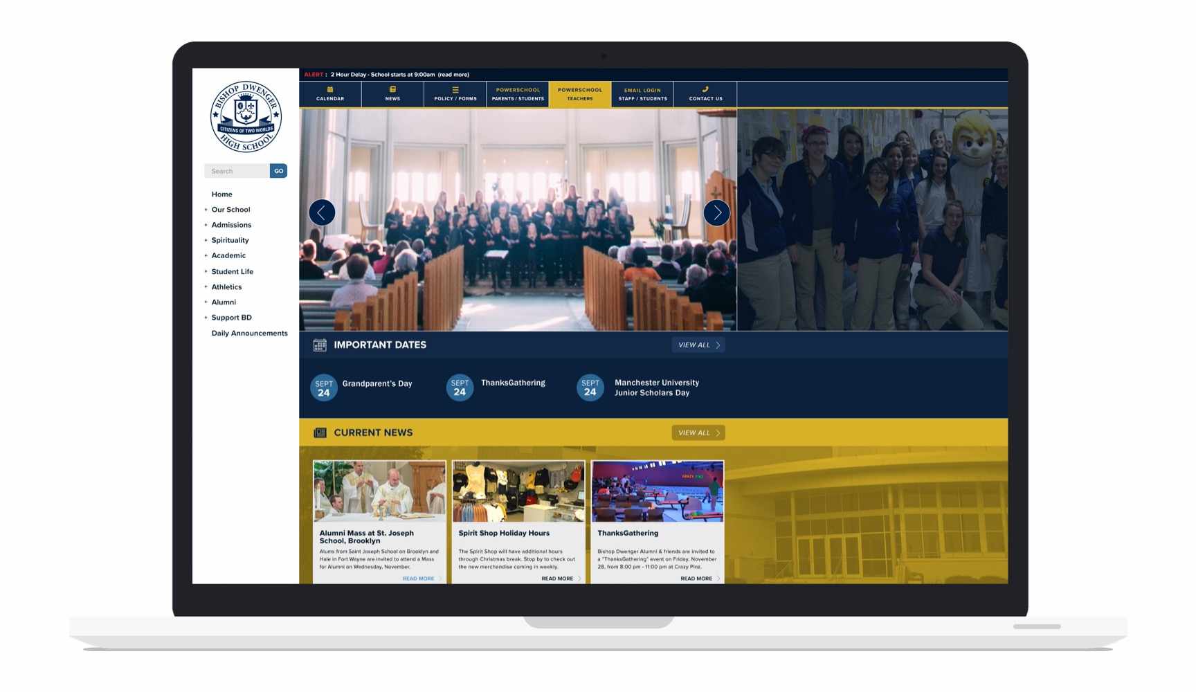
To figure out what content should get prime placement at the top of the page, we imagined ourselves as parents (which wasn't hard to do for most of us). We've all been there - trying to get our kids out the door with only a few sips of coffee to fight a staggering sleep deficit. Oh, and we're already running behind and it's likely snowing!
It was obvious that on mobile the first content on the page needed to be a bright yellow alert banner for delays or cancelations. If any of us actually took the time to wait for our kid’s school to come up in the slowly crawling list of cancelations on the morning news, the school would already be out.
A thumbs twitch below the main greeting, visitors find links to the calendar (more on that below), announcements, news, and most the requested pages. This is where all those critical details about the upcoming events can now be accessed.
The “Quick Links” section used to be at the very top of the page but needed to be relocated. To make sure it could still be found quickly, we designed this section to have vivid contrast so it stood out. Additionally, the buttons are in the same order as they were in the old design so no one would have to re-learn their orientation.

Another short scroll down the page and the content shifts from things you need to know right now, to things that are nice to know. Links to news articles give visitors the opportunity to get info on school-wide events that are coming up later in the school year. There is a section for prospective enrollees to read more about Dwenger and set up a tour.

While all this content provides specific information to targeted groups of visitors, its secondary function is to give a snapshot of Bishop Dwenger’s culture to prospective parents checking out the school. Even at a quick glance, they see an active school focused on academics, sports, and the Catholic faith. This more peripheral messaging is bolstered by the principal’s message, a brief mission statement about Dwenger, and links to discover what Dwenger is all about in more depth.
The footer, rather than being a link graveyard, was re-organized to provide links to the most popular pages. It also gives visitors an easy way to sign-up for the newsletter or connect with the school’s social channels.
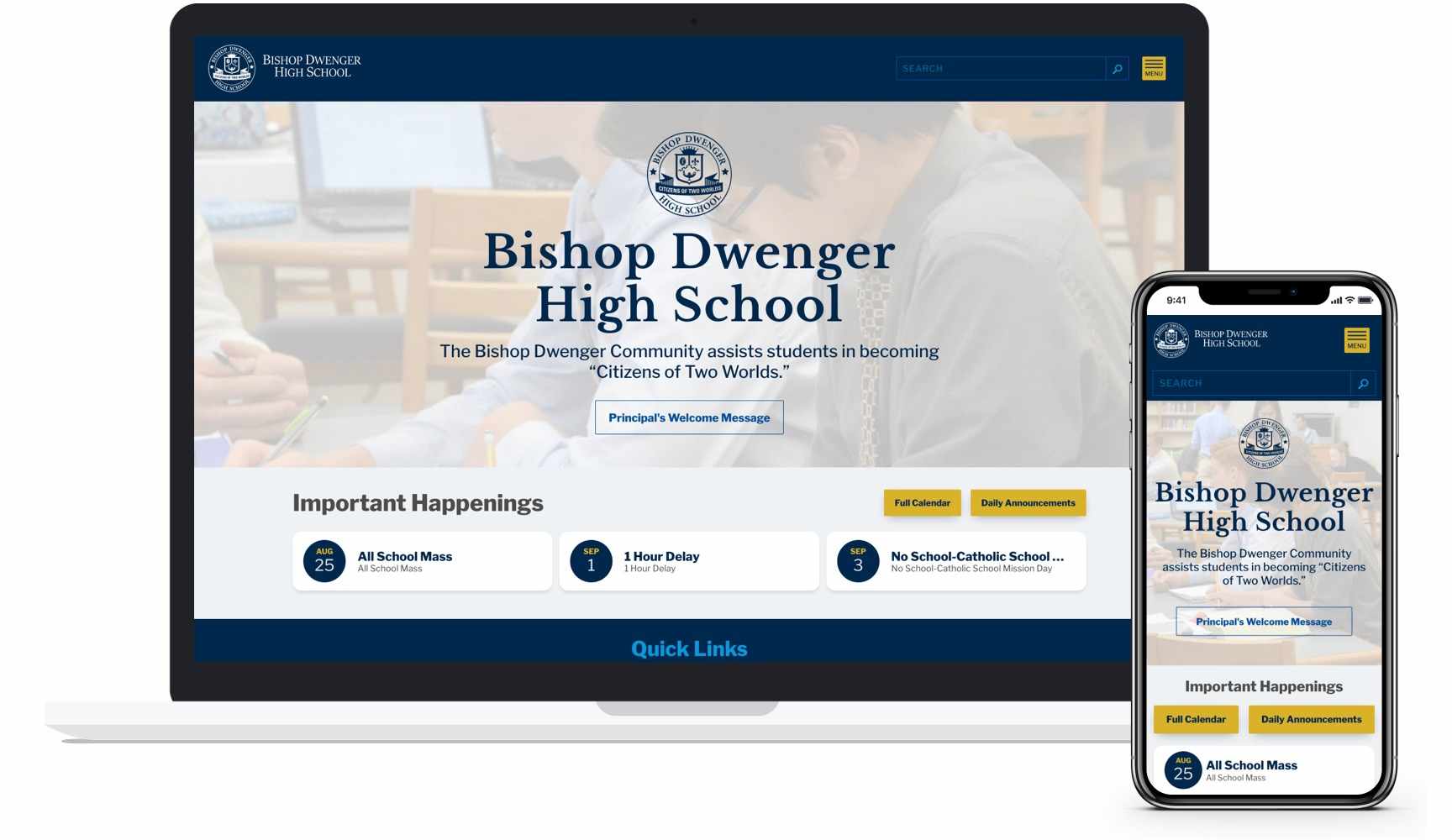
The Mobile Calendar
Designing a mobile version of the most visited page was one of the main reasons for the re-design. It was a big design challenge since there was a lot of information and functionality to fit on a small screen. Visitors needed to be able to see five categories of events by month and week, filter just the events they wanted to see, access more detailed info, and print the calendar.
Drawing inspiration from a couple of the nicer calendar apps out there, we began strategizing how best to keep a lot of information from being overwhelming. We updated the colors for each category to be similar to what visitors were used to identifying with a given category but tweaked to be more easily recognized on a small screen.
This color-coding was carried into the week view of events. A lot of time was spent figuring out the best mix of font sizes and weights so the most important information (i.e., time and event name) was a quick read, while still leaving room for additional details. Filtering and printing are all at the top of the page so visitors can customize their view immediately without having to hunt for those controls.
The Final Product
The site was designed to not distract from the content; by carefully considering typefaces, font sizing, and line-height, a typographic hierarchy was set up to make reading easy. To further give off a "school website feel", motifs like ruled and graph paper background were added discretely to a few sections. We also repurposed elements from the logo as subtle patterns.

Bishop Dwenger’s school colors served specific roles as well. Blue is primarily used on all non-interactive parts of the design while yellow (gold) was used on the majority of buttons and other controls. This approach is meant to help visitors who are digging deeper into the site. We want them to instinctively learn that “If it’s yellow, I can click it and get more information.”
Click here to check out the new Bishop Dwenger website.

